The first set of 2011 Census of Population and Housing data was officially released on 21 June 2012. This rich source of geographically referenced demographic statistics is a treasure trove for any spatial data and mapping enthusiast. Best of all, the data is totally free (but a small fee applies for convenience of having it all on a DVD, and right away).
I was hoping that there will be a mad rush of releases of various mapping applications with demographic statistics post June 21st but a quick search on the internet for “census maps” is not turning up much as yet. So far only general media put some effort into making census statistics more accessible with interactive presentations and simple maps - I listed the most interesting examples in my previous post. How disappointing. The official ABS version of online maps – TableBuilder, is still a few months away (free Basic version will be released on August 21, 2012; if you are prepared to pay $750 for an individual licence or $9,950 for a corporate licence, TableBuilder Pro version will be available to you on August 7, 2012). As someone twitted recently, census data release day felt like a total anticlimax…
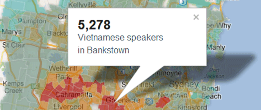
So, to fill the void, I decided to rush the release of my own version of Census 2011 Online Maps. There are over 70 census data items available in the first release of the app (just under 150 if derived information is counted). By popular demand, postal area boundaries are the default geography (and the only option a the moment but more will be added later).
Unlike some traditional online GIS applications where every single map is preconfigured upfront, my Census 2011 maps are generated “on the fly” so, users have a lot more flexibility in customising map parameters and visual presentation (such as, the number of data classes and values of data ranges, colours of thematic drapes, locations of interest – again, more options will be added in the future).
This flexibility is very important in order to enable creation of meaningful thematic maps since there is such a large volume of data available for mapping (Basic Community Profile dataset has close to 8,000 data items!) and secondly, because each dataset, representing either counts, $ values or proportions, has very different characteristics. For example, a handful of datasets can be characterised as having normal distribution, there are some approximating uniform distribution but most have irregular distribution. And quite a few datasets contain extreme values/outliers which are “off the scale” (for example, how about a $132,500 median weekly household income for postcode 2139 or median weekly personal income of $8,312 for postcode 6710!). Single, automated approach to map such a diverse set of data will simply not work. Therefore, I included data histogram to help in selecting the most appropriate classification method (ie. either Standard Deviation, Equal Range, Quantiles or Natural Break – Jenks algorithm). More on how to make the most of available selectors in Census 2011 Online Maps User Guide which is published as a separate post.
Census 2011 Online Maps application is built with free Google Map, Fusion Tables and Visualisation APIs so, no infrastructure for me to look after! Most of the code has been recycled from various tools of mine shortening the development time. Census 2011 Online Maps actually comprises of two separate parts: map configuration module and an updated version of my free-standing reference map (available as a Web Application Service to anyone – read more on the concept of WAS in one of my earlier posts). So, for all practical reasons, Census 2011 Online Maps application is more like a “map creation" or "thematic mapping tool” that allows selection and configuration of raw data, stored in Fusion Tables, for display on a Google Map.
If you really like a particular map you have created, just detach it from the main page and bookmark it, or share with others! Or embed it in your web site… That portability of maps is a special feature of Census 2011 Online Maps application – users are no longer confined to visit my site to take advantage of the information.
The volume and complexity of Census data is probably the reason why not many online maps have been released so far. In all honesty, not so long ago, desktop applications with functionality similar to my Census 2011 Online Maps used to cost tens of thousands of dollars. And online versions costed many more times over that due to the cost of infrastructure. Today anyone can create online mapping applications - for free… I hope that my version will prove a popular choice. Maybe even more popular than a related Postcode Finder app! Help me spread the word so it can reach all those users you cannot afford pricey commercial GIS solutions. Your feedback and feature requests most welcome. The code is available to a selected few and/or can be customised to meet your specific business requirements.
Related posts:
Census 2011 Online Maps User Guide
Mapping Australian social diversity
Mapping social diversity in NSW
More free data with reference map
Web Application Service concept
Saturday, July 7, 2012
Census 2011 Online Maps User Guide
This is a comprehensive introduction to a free online application available on @ aus-emaps.com website and called Census 2011 Online Maps. The application contains a selection of Australian 2011 Census of Population and Housing data published by the Australian Bureau of Statistics. It is designed specifically to facilitate creation of custom thematic choropleth maps with Census 2011 data (that is, maps are not predefined upfront and each is generated “on the fly”, according to user specifications).
Let’s start with some warnings and tips which will help in creating meaningful and informative maps.
GENERAL INFORMATION
Base Geography:
Data:
CONFIGURING MAPS
Start with clicking on a blue configure map text in the top right corner of the page, then follow the steps below.
Data Selection:
Region Selection:
Data Exclusions:
Histogram Customisation:
Selecting Best Data Classification Method:
Changing Classification Method and Colour Scheme:
Generating Thematic Map:
QUESTIONS
If you have any questions regarding the functionality of Census 2011 Online Maps please submit them as comments to this post. Requests for customisation of the application to specific business requirements can be sent to info@aus-emaps.com.
Let’s start with some warnings and tips which will help in creating meaningful and informative maps.
Warning 1: Mapping Census data for the entire country poses some challenges since there are very significant differences between individual regions of Australia. Take for example median weekly personal incomes that vary from $76 to $8,312. It is therefore more practical to generate maps for smaller areas, such as individual States, rather than attempting to create a meaningful summary measure for the country as a whole.
Warning 2: Thematic choropleth maps are considered not suitable for mapping absolute values (eg. counts of persons). If absolute values are used for mapping areas that vary in size, misleading maps can be produced.
On the other hand using ratios, which show the relationship between two quantities, eliminates the influence of area, so that the map becomes meaningful by portraying accurately the distribution of features. Therefore, it is recommended to use only datasets labelled as “proportions” or “median values” for thematic choropleth mapping.
Nevertheless, there are legitimate cases where mapping absolute values can be justified. For example, when geography areas are of equal size (which is most likely the case with smaller geography units and/or urban locations) or when you deliberately want to “visualise absolute numbers” to help in defining territories based on counts of people with certain characteristics (since it easy to identify on the map which polygons are next to each other).
GENERAL INFORMATION
Base Geography:
The first release of Census 2011 Online Maps offers only one geography option - Postal Areas (which are good approximation of Australia Post Postcodes).
Data:
Census 2011 Online Maps application provides convenient access to approximately 150 datasets selected from the Basic Community Profile (only a fraction of 7942 individual datasets published by the ABS but of most interest to all). This initial selection will be extended in due course.
Where appropriate, “proportions of total” for individual datasets were calculated and added to selection. There is also an overall “population density” dataset available for mapping. Full list of available datasets can be downloaded in a csv format by clicking on the following link: Census 2011 Online Maps Data List.
CONFIGURING MAPS
Start with clicking on a blue configure map text in the top right corner of the page, then follow the steps below.
Data Selection:
To simplify selection of individual datasets they have been grouped into themes and topics.
Select Theme:
Select from a dropdown list: Persons, Family or Dwellings
Select Topic:
Select relevant topic from a dropdown list (topics are specific for individual themes).
Select Data Item:
A list of available data items for a given theme and topic will be printed on the page. Select dataset of interest by clicking on the relevant box. Your selection will be indicated by change of box colour to a light blue.
Tip: to reload the current selection just “unselect” and “select” it again by clicking twice on the light blue box.
Region Selection:
Select from a dropdown list. Options include Australia, States and larger capital cities. Default is “Australia”.
Changing region will trigger data refresh (ie. histogram, summary statistics, and data ranges will be recalculated and reloaded).
Data Exclusions:
Sometimes data is not available for all locations, either due to confidentiality or lack of valid answers to Census questions. By default empty cells are not counted in calculations of data statistics (ie. counts, mean and median, etc).
Some data series have lots of zero values. Users have an option to remove cells with “0” from calculations of data statistics. Changing option will trigger data refresh (ie. histogram, summary statistics, and data ranges will be recalculated and reloaded).
Histogram Customisation:
Default method for calculating optimal number of histogram bins is sq root of count of records, divided by 2 and rounded to a full number. Users can adjust the number of bins for a histogram by typing in a preferred number. It will trigger data refresh (ie. histogram will be reloaded).
Selecting Best Data Classification Method:
Start with inspecting histogram to determine how data is distributed. General rule is that for normally distributed data (symmetrical, bell shaped histogram) Standard Deviation is the optimal method for defining values for range breaks.
[Example of histogram of normally distributed data]
In this application St Deviation with 3 classes defines range breaks at -1SD and +1SD. With 5 classes, range breaks are placed at -1.5SD, -0.5SD, +0.5SD and +1.5SD.
Equal Range (also known as Equal Distribution or Interval) is the best option for uniformly distributed data (histogram with bars of similar height) as for example, Median Rents for QLD.
[Example of histogram of uniformly distributed data]
In Equal Range breaks are determined by dividing the difference between max and min values by the selected number of ranges. This method can result in ranges with few or no records, if used with other than uniformly distributed data.
The majority of Census data will have irregular distribution for which Natural Break or Quantiles classification methods are the most appropriate.
[Example of histogram of irregularly distributed data]
Jenks algorithm is used to determine range breaks for Natural Break classification. The algorithm groups data into classes that are themselves as separate as possible, but where the data values within each class are fairly close together. That is, it maximises the differences between the classes and minimises the differences within the classes. This classification can be used to discover spatial patterns within the data, but it can lead to some classes being populated by low numbers of observations. ABS recommends Natural Break as a default classification for Census data but prefers an alternative methodology, based on the Dalenious Hodges algorithm.
Quantiles also work well with irregularly distributed data and this is probably the most well known data classification method. Range breaks for quantiles are calculated by sorting data in an ascending order and dividing into equal parts, based on the number of selected classes. Therefore each range will contain a similar number of units (ie. equal count or proportion of records, polygons). If the entire dataset is divided into halves, the range break is a median. Dividing data into four classes produces quartiles separated by three range breaks. Quintiles have five classes with four range breaks.
The fifth classification method available in Census 2011 Online Maps is “Custom Ranges”. Simply, type in your preferred values in relevant boxes to overwrite automatically generated numbers.
Min and Max values are used to define respectively the lower and the upper limits for the “outer ranges”, inclusive of these numbers. Selectors can be adjusted to exclude those values from ranges, if required.
Changing Classification Method and Colour Scheme:
Select Classification Method:
Select from a dropdown list: St Deviation, Equal Range, Quantiles or Natural Break.
Note to Internet Explorer 7 users: this browser version has very inefficient Javascript processing engine so, when executing complex code that handles large volume of data the browser may be struggling. This could be the case when computing Natural Break ranges. A pop-up window will appear with the following warning: “Stop running this script? A script on this page is causing Internet Explorer to run slowly. If it continues to run, your computer may become unresponsive”. Keep clicking “No” button until the process is finished (usually more than a few times!) and the browser will resume normal operation.
Select Number of Ranges:
Select from a dropdown list a value corresponding to preferred number or ranges. Options vary depending on selected data classification method. Selecting ranges will trigger data refresh (ie. data ranges will be recalculated and reloaded).
Please note, Fusion Tables API has a limit of 5 colour ranges for thematic choropleth drapes. This limitation should not pose an issue for the majority of Census 2011 Online Maps users since ABS recommends 5 data ranges for thematic mapping as an optimal number.
Selecting Colours:
There are 3 single colour schemes (blue, purple and green) and one 2-colour scheme (red-blue) available for selection in the Census 2011 Online Maps application. For convenience, reverse colour option have also been added. Functionality allowing customising colours will be enabled at a later date.
Generating Thematic Map:
To complete map configuration step simply click on a blue button “Update Map”. A new thematic drape will be generated and loaded onto the map.
Please note, you may need to zoom in/ zoom out a few times to “force” update of thematic drapes (it is a known issue with Fusion Tables dynamic layer generation functionality).
Clicks on coloured polygons will open windows with detailed information about individual postcodes.
QUESTIONS
If you have any questions regarding the functionality of Census 2011 Online Maps please submit them as comments to this post. Requests for customisation of the application to specific business requirements can be sent to info@aus-emaps.com.
Labels:
How To - Guides and Tutorials
Tuesday, July 3, 2012
Historic Atlas of the Suburbs of Sydney
The Atlas of the Suburbs of Sydney was created by Higinbotham, Robinson and Harrison, map publishers and lithographers established in 1882 with premises in Macquarie Place. They had obtained permission to produce maps from government survey information, so were able to advertise them as an authoritative source '…compiled from official plans in the Surveyor-General and Registrar-General's offices'.
The Atlas of the Suburbs of Sydney could be considered the first officially published street directory of Sydney. Read more about The Atlas of the Suburbs of Sydney history on dictionaryofsydney.org website. To compare Sydney “now and then” just click on images of old maps and then select "Full record" link to load Google Map interactive application.
Labels:
Featured Maps
Monday, July 2, 2012
SBS - Census Explorer on Google Maps
Keir Clarke from Google Maps Mania has just written a short post on the SBS - Census Explorer. So far it remains the only substantial mapping applications for exploration of the key demographic indicators from Australia's 2011 Census.
The tool allows users to interrogate the census data and visualise on the map the number of persons using one of several dozens of different languages spoken throughout Australia. Using a drop-down menu it is possible to select an individual language and a coloured thematic drape indicating concentration of people speaking that language is then displayed on the map. By clicking on individual suburbs users can get the exact number of the language's speakers at that location.The application has also a handy functionality which allows to compare two language groups for a given location.
Labels:
Featured Maps
Thursday, June 21, 2012
Census 2011 data is out!
Earlier today Australian Bureau of Statistics (ABS) released a first set of information about Australian population and housing based on data collected during a census night on August 9th 2011. Details are fascinating and you could spend hours trawling through thousands of data items describing demographic characteristics of our population - on a national level as well as down to small communities.
Here is some trivia for your information:
But where are the maps, you may ask!? More on this later… here are just a few examples:
SBS: Census Explorer
ABC: Census 2011
Wedding bells falling silent
Old trend no leap of faith
Here is some trivia for your information:
- Total persons counted: 21,507,717
- There are more females than males: 10,873,704 to 10,634,013 (50.6%/ 49.4%)
- Median age: 37 (unchanged)
- The most common ancestries in Australia were English 25.9%, Australian 25.4%, Irish 7.5%, Scottish 6.4% and Italian 3.3%. Proportion of people with Australian ancestry decreased from 29% in 2006…
- While the proportion of people born in Australia remains steady at 69.8% (70.9% in 2006), proportions of those born in New Zealand increased by 0.2% to 2.2%, China (excluding SARs and Taiwan) by 0.5% to 1.5%, and India 0.7% to 1.4%.
- 76.8% of people only spoke English at home. Other languages spoken at home included Mandarin 1.6%, Italian 1.4%, Arabic 1.3%, Cantonese 1.2% and Greek 1.2%.
- The median weekly personal income for people aged 15 years and over in Australia was $577. For families, median weekly income was $1,481.
- There were 9,117,033 private dwellings counted and average number of people per household now stands at 2.6 persons.
- There was a staggering number of unoccupied dwellings on the census night: 934,471 or 10.7% of all dwellings. A lot of people on holidays…
- Proportions of people owning a dwelling outright decreased to 32.1% from 34% in 2006, and there were proportionally more renters in 2011 than 5 years earlier: 29.6% and 28.1% respectively.
- Proportions of dwelling with 4 or more bedrooms increased from 28.1% to 30.3% in 2011. One bedroom dwellings are also more popular: 4.7% in comparison to 4.4% in 2006.
- The median weekly rent was $285. For 10.4% of households, their rent was more than 30.0% of their income. The median monthly mortgage repayment was $1,800.
Census 2011: In depth and interactive
But where are the maps, you may ask!? More on this later… here are just a few examples:
SBS: Census Explorer
ABC: Census 2011
Wedding bells falling silent
Old trend no leap of faith
Labels:
News
Monday, May 28, 2012
New free weather app
A few weeks ago I was approached by a local web developer with an offer of an alternative front end to my existing weather data service. He needed a simple solution that would fit well with the website design concept for one of the clients and my existing three different versions of the weather app did not quite meet his specification. In a quid pro quo arrangement, I ended up with a new weather app to share with the rest of the world while the client gets the benefit of a tailor-made weather information widget for the newly developed site.
So, here it is - I am officially unveiling weather app v4 for your perusal.
Default setting is for Sydney but you can easily change location by adding a city code at the end the URL link. For example, for Canberra the full address is like this:
http://aus-emaps.com/ww4/index.php?code=YSCB_Canberra
Full instructions on how to set up this weather app on your site and a list of city codes are available on aus-emaps.com free widgets page.
My free weather widgets are quite popular, generating over 1 million page views per month (250,000+ visits). Not surprisingly, also getting some attention from mobile users (almost 10,000 visits in the last 30 days).
This latest arrangement gave me an idea - maybe there would be other web developers interested in designing their own versions of weather app? Hence, I am inviting all interested parties to have a go at creating alternative weather widgets with my data. I will provide a sample code and a copy of the database tables to get you started. Only two conditions – the app has to be hosted on aus-emaps.com and it has to have a link to the site. Keep me posted if you are interested!
Related posts:
Weather widget take 3
Free Australian weather widget
Weather widgets via Google Gadgets
Weather on Google Map
Weather maps for winter resorts
Hazmon weather map
So, here it is - I am officially unveiling weather app v4 for your perusal.
Default setting is for Sydney but you can easily change location by adding a city code at the end the URL link. For example, for Canberra the full address is like this:
http://aus-emaps.com/ww4/index.php?code=YSCB_Canberra
Full instructions on how to set up this weather app on your site and a list of city codes are available on aus-emaps.com free widgets page.
My free weather widgets are quite popular, generating over 1 million page views per month (250,000+ visits). Not surprisingly, also getting some attention from mobile users (almost 10,000 visits in the last 30 days).
This latest arrangement gave me an idea - maybe there would be other web developers interested in designing their own versions of weather app? Hence, I am inviting all interested parties to have a go at creating alternative weather widgets with my data. I will provide a sample code and a copy of the database tables to get you started. Only two conditions – the app has to be hosted on aus-emaps.com and it has to have a link to the site. Keep me posted if you are interested!
Related posts:
Weather widget take 3
Free Australian weather widget
Weather widgets via Google Gadgets
Weather on Google Map
Weather maps for winter resorts
Hazmon weather map
Labels:
Handy Tools
Monday, May 14, 2012
Ingres Db adds spatial capability
The latest version of Ingres relational database now also includes support for geospatial data. GIS functions and spatial data types are included out-of-the-box (i.e. do not require additional plug-ins) and make it easy to enable web mapping. Ingres 10S supports spatial applications, such as Esri’s ArcGIS for Desktop and FME but also MapServer and GeoServer.
Ingres 10S is supported by other programming libraries including GDAL/OGR and GeoTools, allowing import, export and manipulation of vector data. Ingres 10S leverages the GEOS geometry and PROJ cartographic projection libraries for manipulating and transforming spatial data between dozens of geographic and planar co-ordinate systems.
Ingres 10S is an open source, enterprise grade database, not as popular as MySQL or PostgesSQL but, as the other options, can be downloaded and used for free. Ingres was first created as a research project at the University of California, Berkeley in the early 1970s. Since the mid-1980s, Ingres has spawned a number of commercial database applications, including Sybase, Microsoft SQL Server, NonStop SQL, but also open source PostgreSQL (which with PostGIS extension is the most popular open source spatial database).
Ingres 10S is supported by other programming libraries including GDAL/OGR and GeoTools, allowing import, export and manipulation of vector data. Ingres 10S leverages the GEOS geometry and PROJ cartographic projection libraries for manipulating and transforming spatial data between dozens of geographic and planar co-ordinate systems.
Ingres 10S is an open source, enterprise grade database, not as popular as MySQL or PostgesSQL but, as the other options, can be downloaded and used for free. Ingres was first created as a research project at the University of California, Berkeley in the early 1970s. Since the mid-1980s, Ingres has spawned a number of commercial database applications, including Sybase, Microsoft SQL Server, NonStop SQL, but also open source PostgreSQL (which with PostGIS extension is the most popular open source spatial database).
Labels:
Handy Tools
Subscribe to:
Posts (Atom)