Tuesday, March 29, 2011

Christchurch earthquake postscript

Just two days after the 22nd February earthquake the NZ Ministry of Civil Defence and Emergency Management (MCDEM) commissioned acquisition of high resolution imagery over Christchurch to assess the damage of the city infrastructure. NZ Aerial Mapping Ltd used Rockwell Commander 690 airplane and Vexcel UltraCam Xp camera to capture 10 cm resolution imagery over the city. This imagery is now available under creative commons licence – total of 19GB. But it can also be previewed on Google Map at koordinates.com:


First spotted on: Google Maps Mania

Related post:
Christchurch earthquake

Monday, March 28, 2011

NSW election map

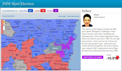
Last weekend NSW voters went to the polls to choose the new State government. As was widely anticipated, coalition parties – Liberals and Nationals have won overwhelming majority of seats. The extent of Labor’s defeat can be best gauged by looking at a map which shows electorates coloured according to a winning party. Blue, traditional colour associated with the Coalition, covers almost the entire State of NSW, with only a few islands of red depicting Labor held electorates. The map was created by Sydney Morning Herald to report on the progress of election results.


The map is quite intuitive to use – just move the mouse over the polygon to reveal electorate name and click on a polygon to bring additional information about the electorate in a side panel. As polygons are created from point data they can be highlighted on mouse over. The downside of this approach is that, because of the limit on how many points browsers can handle, developers had to sacrifice the quality of boundary outlines, keeping points to a minimum. The effects are gaps and overlaps in individual polygons when you zoom too close.

As noted in GIS related media, this was the only map used in reporting election results in NSW. Why this lack of interest to commit resources and present “the battlefield” spatially? I suspect that it may have something to do with the availability of State electoral boundary data – a quick search on the Internet did not yield any results. Creating such boundaries from secondary information sources may have proven too big of a task.

First spotted on: Communica

Wednesday, March 16, 2011

Geospatial Revolution

If you are having any doubts that geography, geospatial technologies and all those spatial concepts developed throughout the centuries underpin almost every aspect of our everyday life, please have a look at this series of short videos. Produced and released by Pennsylvania State University under the banner of the Geospatial Revolution Project.

"The mission of the Project is to expand public knowledge about the history, applications, related privacy and legal issues, and the potential future of location-based technologies.

Geospatial information influences nearly everything. Seamless layers of satellites, surveillance, and location-based technologies create a worldwide geographic knowledge base vital to solving myriad social and environmental problems in the interconnected global community. We count on these technologies to:

* fight climate change
* map populations across continents, countries, and communities
* track disease
* strengthen bonds between cultures
* assist first responders in protecting safety
* enable democracy
* navigate our personal lives..."


The videos are a great testimony to the power of geospatial technologies, today at fingertips of almost any individual with access to the internet, mobile phone and/or GPS receiver. Whether used for your personal convenience or in business, maps are so much more than just pretty pictures... If you have a problem to solve, think maps for a better perspective!

Friday, March 11, 2011

Japan hit by massive earthquakes

News is just coming in about a series of earthquakes in Japan, the largest measuring 8.9, near the east coast of Honshu and potentially triggering tsunami with waves up to 6 meters high. There was another one measuring 6.8 north of Tokyo and some more further afield.

[Official USGS kmz feed on a map that can be shared]

[Many aftershocks happening as shown on this map]

[Gescience Australia estimates of felt and damage radius]

[Tsumami warning from Japan Meteorological Agency]


Update: It has been 4 days after the event but the tragedy is not over yet… thousands of people still missing, regional areas running out of water, food petrol and survivors threatened by radiation from damaged nuclear power plants… Simply no words to express adequately the sadness and my sympathy to all those affected by the earthquake and the resulting tsunami.

The world’s GIS community has contributed a lot of resources to depicts the events on the maps for all those searching details on the event. A few examples are presented below for information.


Links to more maps:
Google Crisis Response
Animated timeline: main earthquake and aftershocks (in HTML5)
New York Times: Tsunami propagation map
New York Times: Interactive maps with counts of dead and missing persons, building damage
Washington Post: Earthquake in Japan interactive map
New York Times: Forecast for Plume's Path

Thursday, March 10, 2011

WA housing affordability index

Bankwest has just released a report on housing affordability in WA. Bankwest's affordability index is a ratio of average house price in a Local Government Area to average worker's salary. Index values are ranging from 0.9 for Mount Magnet to 49.9 for Peppermint Grove (5 is the upper limit of what is considered “affordable”). The information has been presented in WA Today as an alphabetical list of LGAs with corresponding index value. The paper concluded that workers (defined as a group consisting of police officers, nurses, emergency workers and teachers) “…need to move to Perth's extremities - or even out of it” to find affordable housing.

This is a good example where information could be presented in a more visually attractive and more informative way – using maps! I have converted Bankwest index table to a thematic map to illustrate how this information could be presented to highlight regions which are still considered affordable.


The key to creating an informative thematic map is to pick the right method for dividing values to be mapped into meaningful categories that convey a certain message. In this case, the story is about locations which are considered affordable. The bank has already defined affordability cut-off value as 5 so that information should be preserved and conveyed on the map. There are many statistical approaches to decide on the split of data to create meaningful categories but on this occasion a simple “rule of thumb” approach is sufficient.

There could be just 2 categories – affordable and non affordable – to convey the message adequately. However, since two-colour map would be quite boring, we could also try to highlight “tail ends” of the data, that is cheap housing areas (eg. those with index value of 2 and below) and those totally out of reach (with index value of 10 and over). The values picked to define the two additional ranges are totally subjective but it does not detract from the key message – that is, which locations have affordable housing.

The selection of colours to present the information on the map is also important. I opted here for a combination to convey the message that there are two categories (affordable and non affordable) but also to indicate grading of index values from “low” to “high”.

Concluding, my appeal is, whenever you think about releasing information relating to postcodes, suburb or other spatially defined regions, please consider putting it also on an interactive map to create a bigger impact! And use my free reference map to enable easy sharing of the information for even greater impact!

Related Posts:
How maps can improve sales
More free data with Reference Map

Wednesday, March 9, 2011

China targets illegal maps

Yes, it is not a mistake. Maps can be “illegal”. That is, only in countries that have in place a licensing regime – such as China. The aim is to remove from the web maps that have “political mistakes” (I presume it refers mainly to representation of borders and “territories”) and those that disclose State secrets (I remember this rule from the old communist country of my origin, where city maps had big holes where the industrial zones were located). Well, that’s one way to achieve consistency in mapping data across the whole country, just hope no one will have similar ideas in Australia!

What’s really interesting, are statistics quoted by the Chinese State Bureau of Surveying and Mapping: it “…uncovered 1,058 cases of illegal mapping services, including more than 30 relating to foreign organisations and military”, “…3,686 websites out of 41,670 web mapping service websites were found to contain political mistakes, and more than 200 websites were closed”. Mapping must be quite popular there, but that’s China. I wonder what would be the numbers for Australia (total websites of course, not closures!).

On a related topic, Chinese government is not the only one censoring online content. Google created this interesting map that shows world wide statistics about “Government requests directed to Google and YouTube” to remove content from services, or provide information about users of services and products.


First spotted on: Spatial Sustain