Saturday, August 20, 2011

Weather on Google Map

Last week Google added weather layer to its official version of Google Map. Information is coming from weather.com and includes current temperature, humidity and wind data as well as 5 day temperature forecast. Weather icons on the map represent today’s forecasted conditions and background map is simplified when weather layer is selected to make icons more visible.


There are many sources of local weather information with global coverage so, the addition of this data layer should have been expected sooner or later. Weather information is extremely popular – these days any larger portal has at least a weather widget if not the entire weather forecasting and publishing arm (eg. Yahoo7 and weatherzone.com.au). Weather apps are amongst the best sellers on iTunes. My simple weather widget is the most popular “page” on aus-emaps.com - with over 800,000 pageviews per month.

The goalpost has moved again as weather information became another commodity item. Listing a current temperature and/or forecast is an expected norm from any news or local community focused portal or blog. Tabular listings of detailed weather information are increasingly being supplemented with maps showing all sorts of details, including animated clouds, rain intensity, lightning strikes etc. (as per example from weatherchannel.com.au below). So, mere presentation of information will no longer be a distinctive feature. Intensified competition will only foster innovation and specialisation – to the benefit of all users!


Related Posts:
Weather widget take 3
Free weather widget upgrade
Weather map


Tuesday, August 16, 2011

Postcode Finder upgrade

Last month Australian Bureau of Statistics (ABS) released the latest version of boundaries for use with Census 2011 data, including the so called non-ABS structures: postal areas and suburbs. It also coincided with a major upgrade to Google’s Fusion Tables, prompting me to redevelop the somewhat clunky version of Postcode Finder served from aus-emaps.com.
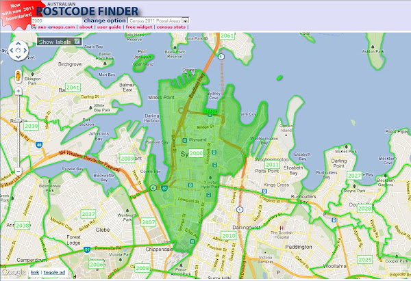


Postcode Finder is quite a popular tool. However, I was forced to degrade the functionality of the application after a significant hike in the cost of data service. The first version of the application was built with free postal boundaries data service provided by a third party as a Web Map Service (WMS). I wore the initial cost when the supplier introduced charges for the service but could not justify a subsequent hike in fees, opting instead to build my own version with KML data.

I wanted to avoid implementation and maintenance hassles associated with managing my own GIS infrastructure but the compromise was less than optimal solution in terms of performance and useability. Fusion Tables now offer a great alternative to WMS since it comes with own version of an “image service”, capable of real-time rendering of geographic data (eg. note the shading of a searched postcode on the map).

Functionality of Postcode Finder remains very similar to the previous version but there is a significant improvement in performance and useability (not to mention that the application is now built with version 3 of Google Map API as well). I would like to add more boundary layers over the coming weeks but it is not a straightforward task. Unfortunately, Fusion Tables suffer from some limitations in terms of handling complex polygons so, it is all subject to finding some work around, or Google sorting out the issues.

For example, in case of postal areas, I had to generalise boundaries with the Douglas-Peucker Simplification Algorithm (using 10m tolerance which reduced the file by some 30% without noticeable degradation of the boundary details however, unfortunately, not preserving topological consistency between boundaries) but it was still not enough to import postal area 6740 in WA and 0822 in NT into the Fusion Tables. I had to use 50m tolerance for those two polygons to further reduce their complexity. Google applied its own generalisation algorithms on top of it on import. The side effect is less than perfect match of adjoining boundaries at a street level resolution.

All issues aside, I hope you will find the new version of Postcode Finder much more responsive and better suited to a wider range of requirements.

Related Posts:
Mapping social diversity in NSW

Fusion Tables yet to ignite
Postcode Maps and population statistics
Large format PDF Postcode maps

Monday, August 15, 2011

ArcGIS software for $100

You may be interested to know that ESRI, developer and supplier of one of the most popular commercial GIS software, also offers a home use licence for a suite of its products. For a $100 annual fee, the ArcGIS for Home Use 12-month term license includes:
  • ArcView
  • ArcGIS 3D Analyst
  • ArcGIS Geostatistical Analyst
  • ArcGIS Network Analyst
  • ArcGIS Publisher
  • ArcGIS Schematics
  • ArcGIS Spatial Analyst
  • ArcGIS Tracking Analyst

This offer is available to anyone. The catch is that the software is supplied only for non-commercial, self-education purposes. For any other use, you have to pay many thousands of dollars to acquire the software.

This is a similar program that Microsoft introduced a long time ago for its Office suite of software products. For example, if your employer has purchased Microsoft Office for use within the organisation, you can obtain the same software package for home use for under $50.

The ArcGIS for Home Use program is available worldwide. Customers in the United States can order it online. Customers outside the United States should contact their local distributor .

Thursday, August 11, 2011

Visualising correlations on maps

Correlation is a statistical technique very often used in data analysis. It can show whether and how strongly pairs of variables are related. It normally involves lots of mathematical calculations but a quick insight into the phenomenon under investigation can be gained by simply superimposing the data on a map, if both datasets have a common spatial component (eg. location).

Take, for example, a case of recent London riots, mapped on MapTube. Overlaying locations of civil commotions with Index of Deprivation (ie. a measure of poverty) allows drawing a hypothesis that poverty and propensity to violent demonstrations are related. The correlation may not necessary be obvious when analysing each dataset in isolation and in a numerical form.


A point to note however is that, if the two variables are said to be correlated they may or may not be the cause of one another. In other words, correlation does not imply causality. The correlation phenomena could be caused by a third, previously unconsidered phenomenon, called a lurking variable or confounding variable. For this reason, there is no way to immediately infer the existence of a causal relationship between the two variables. Hence, one should not jump to the conclusion that “poverty is a major factor contributing to London riots” without examining the phenomenon in more detail.

As a side note, I am very surprised to see so much “red” on the London map, implying that the majority of central suburbs are poverty stricken areas - with only a few pockets of wealth on the city fringes. This picture is in big contrast to Sydney where underprivileged areas are concentrated mainly in the south-western part of the city and, most importantly, account only for roughly a quarter of the overall metropolitan area. Australia indeed seems to be a very lucky country…

London Riots Map first spotted on Google Maps Mania

Related Posts:
How maps can improve sales
Bad location can send you broke
Tracking things with maps
Maps in Viral Marketing
Mapping social diversity in NSW
Interactive Atlas of NSW