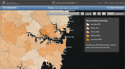
All the information is presented as a series of thematic map overlays in four categories:
- People (eg. population, health, housing, religion, indigenous population, indexes of relative advantage/disadvantage, crime);
- Economy (eg. labour force, taxation and revenue, and production of fruit and vegetables, oils and grins, and livestock);
- History (eg. information on settlement, State elections and boarders); and
- Environment (including vegetation, geology and soils, and locations of national parks).
Users have a choice between satellite image or roads map as a base layer and can adjust transparency level of thematic overlays. Each overlay is accompanied by a comprehensive legend, explaining the meaning of presented data. A click on individual region brings up a pop-up window with information about the region, presented as charts and gauges.

The Atlas of New South Wales is quite responsive considering the amount of data that is required to present thematic overlays. It would benefit though from a bit more legible charts and access to source data in a tabular format and/ or for download. Overall, the application is well built and very simple to navigate through.


2 comments:
Hi Arek,
Thanks for featuring the Atlas of NSW and for your suggestions.
> It would benefit though from a bit more legible charts
We are planning for another release in the next few days which will address this, with larger fonts in all charts.
> and access to source data in a tabular format and/ or for download
Many of the other sites we looked at presented overly-complicated results, so we deliberately kept the presentation of the datasets very simple, so that novice (non-GIS) users won't be overwhelmed.
But providing access to the source data for expert users is a good idea, and something we'll look at.
We are also working with more interactive charting engines, so watch this space!
I will, with great interest! The Atlas has a potential to become one of those apps that can cater for many various levels of users, from novice to expert. Good luck with your project!
Post a Comment