Telstra’s Sensis has just lost an appeal with regard to Federal Court judgement that said its White and Yellow pages are not protected by copyright law. The key to the decision was that those compilations lack “creative spark” and hence cannot be protected under copyright law that requires “independent intellectual effort” to create the works. This ruling has important implications for all kinds of factual data collections, including listings of real estate, names and addresses or… databases with map data. Sensis will be seeking leave to appeal to the High Court to revert the decision.
It begs an interesting question: does it mean that all that high resolution imagery of your neighbourhood and representation of local roads, or cadastre boundaries, or geocoded addresses, are “free for all”? Google and others who publish such information would have no legal grounds for preventing people from copying it all in droves…
Thursday, December 16, 2010
Tuesday, December 7, 2010
Mapping Above and Beyond
Maps break all the barriers…Who would have thought that maps and music can go together! Above and Beyond - Trance Around the World site has just released an interactive Google Map application that shows real-time twits referencing @aboveandbeyond tag from all over the world. The maps also shows locations of major trance music related events and comes loaded with plenty of options for sharing via Facebook and Twitter.

I recently started to listen to quite a lot of trance music on the internet - Above and Beyond weekly sessions in particular. Session #343 in my favourite so far. Now that I think about it, “spatial references” are very prominent on this site: “around the world”, “above and beyond”… so the map was a very logical addition!
I recently started to listen to quite a lot of trance music on the internet - Above and Beyond weekly sessions in particular. Session #343 in my favourite so far. Now that I think about it, “spatial references” are very prominent on this site: “around the world”, “above and beyond”… so the map was a very logical addition!
Thursday, December 2, 2010
Free postcodes with Reference Map
Following on from my yesterday's announcement about free reference map service - just a quick post on how to take advantage of free postal boundaries data that come pre-packaged with it.
To view on a map any of 2,507 postal area boundaries at full resolution (as defined by the Australian Bureau of Statistics for Census 2006 population and housing data) just follow this simple URL pattern:
Multiple postcodes can be added to the map as follows (at this stage one at a time only):
A set of simple instructions on how to configure other map parameters can be found on aus-emaps.com web widgets page.
Since this reference map can be embedded in a website page, a simple javascript code can add additional functionality to render the content dynamically. It means you can now start serving postal boundaries and/or any other data in kmz or geoRSS format directly on your web site! Here is a link to a simple example showing you exactly how to do it.

And this file will also be handy to script the functionality: list of postal areas (Census 2006 version in csv format). Please note, Northern Territory postal area boundary data are named with leading "0" (ie. 0800).
Related posts
More examples of use of Reference Map service
Australian Postcodes User Guide
Post code maps and population statistics
Free postcode search widget
To view on a map any of 2,507 postal area boundaries at full resolution (as defined by the Australian Bureau of Statistics for Census 2006 population and housing data) just follow this simple URL pattern:
http://www.aus-emaps.com/svs/ref/map.php?kmzl=2000&svs=2
Multiple postcodes can be added to the map as follows (at this stage one at a time only):
?kmzl=2000,3000&svs=2,2
A set of simple instructions on how to configure other map parameters can be found on aus-emaps.com web widgets page.
Since this reference map can be embedded in a website page, a simple javascript code can add additional functionality to render the content dynamically. It means you can now start serving postal boundaries and/or any other data in kmz or geoRSS format directly on your web site! Here is a link to a simple example showing you exactly how to do it.
And this file will also be handy to script the functionality: list of postal areas (Census 2006 version in csv format). Please note, Northern Territory postal area boundary data are named with leading "0" (ie. 0800).
Related posts
More examples of use of Reference Map service
Australian Postcodes User Guide
Post code maps and population statistics
Free postcode search widget
More practical map apps from Oz
Keir from Google Map Mania blog alerted me about a couple of interesting applications from Australia he reviewed recently. The first is called 'Touring to Australia' and is essentially free online trip and itinerary planner. It allows you to find places to stay and things to do and see on your trip. Just choose your destination and then select from a number of categories of markers to view on the map. You can select from accommodation, excursions, rental services, places of interest and activities. Whilst browsing the map you can add individual hotels and points of interest to your itinerary. Great tool for planning your next trip, business or private.

The second one is called 'Neet Street' and is a tool for reporting community problems which are then passed on to the appropriate authorities. Using Neat Streets you can report road obstructions, vandalism, potholes, fallen trees, abandoned trolleys, litter, and graffiti. You can download a Neat Streets application for the iPhone, Blackberry, and Android based phones. With the apps you can take pictures and submit community problems directly from your smartphone. The latest submitted photos and problems are displayed on a Google Map on the Neat Streets website home page. Neat Streets automatically forwards the reports to the appropriate authority based on the GPS location.

The second one is called 'Neet Street' and is a tool for reporting community problems which are then passed on to the appropriate authorities. Using Neat Streets you can report road obstructions, vandalism, potholes, fallen trees, abandoned trolleys, litter, and graffiti. You can download a Neat Streets application for the iPhone, Blackberry, and Android based phones. With the apps you can take pictures and submit community problems directly from your smartphone. The latest submitted photos and problems are displayed on a Google Map on the Neat Streets website home page. Neat Streets automatically forwards the reports to the appropriate authority based on the GPS location.
Wednesday, December 1, 2010
Free Reference Map service
I am launching today my newest creation: free reference map service for publishing and sharing spatial information. I am rushing this release since the end of the year is very close! Currently it only supports spatial data in KML/KMZ and geoRSS format and standard Google base map options but I am planning to add a lot more functionality and content over the coming months. Simple instruction on how to take advantage of available functionality is on aus-emaps.com free web widgets page. I will highlight here only one thing you really need to know to publish and share your own maps: just reference publicly accessible KML/KMZ or geoRSS file as follows http://www.aus-emaps.com/svs/ref/map.php?kmzl= FullURLaddressOfYourFile . It is as simple as that. An example of what you can do with it is below:
Actually, the whole concept behind the service is rather complex (and exciting!) but I will not go into details at this point it time. True, there are many other initiatives, possibly far more advanced, to enable easy creation and embedding of maps but they don’t allow for as much flexibility as I have in mind for my version. My idée fixe with content portability and reusability/repurposing is taking me into uncharted territory… Just consider this option – if you find something of particular interest on a web page, wouldn’t it be nice to be able to “cut it out” and take with you to bookmark just that bit and/or reuse (give another perspective!) in your own online endeavours (whether private or public)? Today I am introducing to the world “detach” concept that will allow you to do just that!
Detach function is a very simple idea, a variation on “link to” if you like, but opens up so many possibilities! If you like the map above, just “detach” it from this page to open it in a new window. Then you can bookmark it or add to favourites for future reference, or shorten the URL with your preferred tool and share via Twitter, or Facebook, or LinkedIn or any other social network – with own commentary and spin! This process can be repeated endlessly… And if you are publishing a blog or forum, you can easily combine a number of layers in a single reference map application to provide your unique content and commentary… Again, this process can be repeated endlessly, and with no need to return to the site where the map was first published…. And if you are a developer, you can insert a script to add content dynamically… Implications of such possibilities are far reaching and will probably be best discussed in a separate post. I will only mention that “detach” is not like “clip content” functionality recently dropped by Google from its range of services when they decommissioned Google Notebook – the emphasis here are on portability of content permitted for sharing by content creator. Various back end services to discover what’s available for reuse are coming in 2011!
I first came up with “detach” concept for YouTube video player app but since it is still in alpha release, I have not widely publicised that option. I intend to enable “detach” functionality for all my widgets so they can be shared and used not only via dedicated personal pages (like iGoogle) or via embedding into web pages but also on their own, without attaching to specific “location” on the web!
As I am yet to make a switch to version 3 of Google Map API this shareable map service is build with version 2 (it has proven quality and reliability although lacks some advanced features of the latest version). Since I am reusing many components from my other applications, it was easier for me to work with that version. I will be switching all my apps to Reference Map platform and upgrade to v3 over the course of next year. Any feedback and comments most welcome!
Tuesday, November 30, 2010
Generalising geographic data
 It often happens that the dataset you have is very detailed and hence very large. Displaying such volume of data in online mapping applications (eg. as KML on Google Map) is out of the question. The only alternative is to reduce the number of vertices to reduce the overall size of the file (ie. generalise the data). There is an excellent free online tool to do just that and surprisingly it works much better than commercial software that costs a fortune. It is called MapShaper.
It accepts spatial data in shapefile format only. It is an online service and you can upload files up to 80MB in size for processing. There are 3 generalisation algorithms to choose from. Activation of generalisation process itself is as simple as moving a slider “left to right” (from 0% reduction to 99%) – the result is visible on the screen instantaneously. Another great feature of the tool is that you can view original file underneath the generalised version to assess the quality of the process but also to pick the right generalisation level for your requirements.
Processed files can be downloaded back in either shp or EPS format (so it’s is also a great tool for straight conversion of files from shp format into EPS format, for use with vector graphics software!). There is simple edit functionality as well so you can add/delete vertices manually, if required. Generalisation process preserves topology so boundaries of adjoining polygons are generalised in an identical fashion – that is, they still “fit” perfectly. All in all, MapShaper is very straightforward to use.
File size still counts when performance of online mapping tool is the objective. For example, it will not be possible to display electoral boundaries as a single, full resolution file in Google Map application. But original 25MB shapefile can be reduced to just a few hundred KB using MapShaper tool, and then even further by converting shp to gzipped KMZ format. Here is an example of a Google Map application that uses both, full resolution data for close-ups and generalised version for whole of the country view: Australian elections map (work in progress!).
Related posts:
Free map service preview
Converting csv data into shapefile
Converting shapefile into KML
Colours for thematic mapping
Free GIS Tools – Google Map
Free Address Validation Tool
Manual geocoder for 70 countries
Wednesday, November 24, 2010
Converting shapefile into KML
In the inaugural post in the Free GIS Tools series I presented Google Map API as a very powerful online GIS alternative. Google Map has the capacity to display spatial data in various formats but probably the most attractive option is its native support for KML/KMZ. It takes only one line of code to display complex spatial information on a Google Map – as long as it is in that format. True, not all KLM features are supported in Google Map but you can still create great maps using a single KML file. Try aus-emaps.com free map service to test how well Google Map handles KMZ files: Victorian bushfires aftermath, current earthquakes.
KML/KMZ is the only spatial data format directly supported by free Google Map and Google Earth desktop application. However, a lot of free spatial data is distributed in another very popular GIS format: shapefile (shp). In order to display that data in Google Map or Google Earth, it has to be converted to KML/KMZ format.
There are many tools available for download, or that are bundled with commercial software to do that conversion, but I found only one that really work for me. And the best thing is that it is totally free! It took quite an effort to find so, by sharing this information I hope to save you many hours of fruitless trawling through the Internet. Here are the details.
ESRI Shapefile to KML Converter by reimers.dk
Simple but effective desktop tool (it works!) available for free download. Just point to the shp file you want to convert, select attributes to include in description field and press a button to run conversion. The only limitation is that you don't have a choice in selecting colours.

Here is an example of generated output: World Borders in KMZ (1.14MB kmz file draped on Google Map).
To reduce the size of KML file for distribution or deployment just gzip it. It is easy done using Google Earth “save as” function. That is, open your KML file in Google Earth and when you save it, it will be automatically converted to a compressed gzipped format with kmz extension.
For custom conversions from shp polygons to KMZ format, such as splitting a large file with many polygons into smaller files with individual polygons only (eg. to convert a single 60MB shp file with postcodes into 2,500 individual KMZ files), or grouping of polygons into custom areas (eg. to create sales or franchise territories by amalgamation of postcodes), or converting shp polygons into a thematic map layer (eg. by assigning colours to polygons based on specific attributes, like for example electorates by political party holding the seat), you will need more advanced tools. I can help you with those conversions for a small fee. Here is a sample of a thematic KMZ file using a selection of Sydney suburbs. I also have various polygon based data in KMZ format for immediate delivery (eg. postcode boundaries, as used in aus-emaps.com postcode finder service). Don’t hesitate to ask!
The process is a bit convoluted, I admit. You could take a shortcut by pasting latitude and longitude coordinates directly into KML “shell” but you will need the right template for this in the first place. Using Google Map’s MyMap drawing and embedding functionality is a simpler option but you will not be able to create complex polygons (eg multi-part and/or doughnut type).
I am currently working on a public tool to generate custom polygons from administrative boundaries in a few simple steps. Coming up in 2011! But I will also have to put some though into creating a dedicated KMZ generation tool so you can do it all from a single web page... added to the list of “Things to do!”.
Related posts:
Free map service preview
Converting csv data into shapefile
Colours for thematic mapping
Free GIS Tools – Google Map
Free Address Validation Tool
Manual geocoder for 70 countries
KML/KMZ is the only spatial data format directly supported by free Google Map and Google Earth desktop application. However, a lot of free spatial data is distributed in another very popular GIS format: shapefile (shp). In order to display that data in Google Map or Google Earth, it has to be converted to KML/KMZ format.
There are many tools available for download, or that are bundled with commercial software to do that conversion, but I found only one that really work for me. And the best thing is that it is totally free! It took quite an effort to find so, by sharing this information I hope to save you many hours of fruitless trawling through the Internet. Here are the details.
ESRI Shapefile to KML Converter by reimers.dk
Simple but effective desktop tool (it works!) available for free download. Just point to the shp file you want to convert, select attributes to include in description field and press a button to run conversion. The only limitation is that you don't have a choice in selecting colours.
Here is an example of generated output: World Borders in KMZ (1.14MB kmz file draped on Google Map).
To reduce the size of KML file for distribution or deployment just gzip it. It is easy done using Google Earth “save as” function. That is, open your KML file in Google Earth and when you save it, it will be automatically converted to a compressed gzipped format with kmz extension.
For custom conversions from shp polygons to KMZ format, such as splitting a large file with many polygons into smaller files with individual polygons only (eg. to convert a single 60MB shp file with postcodes into 2,500 individual KMZ files), or grouping of polygons into custom areas (eg. to create sales or franchise territories by amalgamation of postcodes), or converting shp polygons into a thematic map layer (eg. by assigning colours to polygons based on specific attributes, like for example electorates by political party holding the seat), you will need more advanced tools. I can help you with those conversions for a small fee. Here is a sample of a thematic KMZ file using a selection of Sydney suburbs. I also have various polygon based data in KMZ format for immediate delivery (eg. postcode boundaries, as used in aus-emaps.com postcode finder service). Don’t hesitate to ask!
Use case example: Create outlines of polygons and show in an embedded map on a website (using collection of free tools and services available from aus-emaps.com)
Steps:
1. Define vertex coordinates of custom polygon area using simple geocoder tool from aus-emaps.com (select “Point” option and click on the map, reposition markers as required, copy to Notepad).
2. Convert a list of points in csv format to shp file format using instructions provided in a recent post titled “Converting csv files into shapefile”.
3. Convert shp file into KML using tools introduced in this post.
4. Convert KML file into KMZ format using Google Earth (open KML file and “Save As”…) [optional step]
5. Upload KML/KMZ file to your server and reference its URL address in an aus-emaps.com free map service.
6. Embed the map in you web page using HTML’s iframe element.
The process is a bit convoluted, I admit. You could take a shortcut by pasting latitude and longitude coordinates directly into KML “shell” but you will need the right template for this in the first place. Using Google Map’s MyMap drawing and embedding functionality is a simpler option but you will not be able to create complex polygons (eg multi-part and/or doughnut type).
I am currently working on a public tool to generate custom polygons from administrative boundaries in a few simple steps. Coming up in 2011! But I will also have to put some though into creating a dedicated KMZ generation tool so you can do it all from a single web page... added to the list of “Things to do!”.
Related posts:
Free map service preview
Converting csv data into shapefile
Colours for thematic mapping
Free GIS Tools – Google Map
Free Address Validation Tool
Manual geocoder for 70 countries
Thursday, November 18, 2010
Free GPS navigation in Android phones in Oz
This week Google released its free turn-by-turn navigation app for Android smart phones in Australia. It is called Google Maps Navigation. It was only a matter of time since Google has already launched similar services in the US and UK. There is no peed limit information but otherwise, it is the “whole GPS package and more”… Smartphone based navigation applications are gaining rapidly over lower end traditional GPS tools.
Related Posts:
Google enters mobile GPS Navigation Market
Google Maps Navigation launch in UK
New Features on Google Map for mobiles
Free GPS navigation tool for iPhone
Pushing the limits of GPS navigation
Trends and opportunities in mobiles market
Mobile map giveaway from Nokia
Tom Tom GPS navigation in iPhone
Ban on use of phone GPS navigation in cars
Wednesday, November 10, 2010
Incorrect maps lead to war
Oh, and on the subject of spatial information and business, GIS is not perfect. Bad data and bad maps can cause a lot of troubles... As recently reported “…a Nicaraguan military commander caused an international incident by leading his soldiers into Costa Rican territory…” Apparently, Google Maps were wrong. There are many disputes around the World caused by less than accurate representation of national borders.
Although the whole premise of the article is now proven incorrect, nevertheless it highlights the importance of using correct spatial data for decision making. Even generally trusted and reliable sources can get things wrong. So, read the small print and disclaimers before embarking on the big decisions!
Although the whole premise of the article is now proven incorrect, nevertheless it highlights the importance of using correct spatial data for decision making. Even generally trusted and reliable sources can get things wrong. So, read the small print and disclaimers before embarking on the big decisions!
Bad location can send you broke
All spatial industry professionals know the importance of "location" in many aspects of business operations but the statement may be an eye opener for those not dealing with spatial information for business decisions on day to day basis. An article published earlier this week by smartcompany.com.au and titled: Poor site selection caused Kripsy Kreme crash, Sumo Salad founder Luke Baylis says well highlights the issues.
“Collapsed donut chain Krispy Kreme expanded too rapidly and selected extremely poor sites for its products… the market for ‘fat, greasy food’ remains large and it was Krispy Kreme's expansion strategy that led to its troubles, and not the healthiness of its food… they weren't overly clever in the way the expanded, in terms of their site selection and the positioning of their stores … in lower socio-economic demographics, their product would have had more appeal - people generally aren't as health conscious in those areas, according to research…”
Geodemographic analysis techniques and tools have been around since 1980’s but you don’t have to apply complex statistical models and methodologies to gain an insight into your customers or profile catchment areas of your stores or sales territories. Simple Census data from the Australian Bureau of Statistics and thematic maps are enough to get you stared and visualise relevant information. As they say, picture is worth 1,000 words! I will continue on this subject with a few follow up posts so, stay tuned. Meantime, here is a link to thematic maps with Census statistics for postcodes, with over 90 various demographic characteristics available for analysis.
Tuesday, November 9, 2010
Atlas of Living Australia
The mapping application supporting Atlas of Living Australia is built with OpenLayers implementation of Google Map and has quite a few interesting features. In particular, I like the concept of local, regional and species "perspective" to access the information via a map driven interface. Local "your area" view gives a quick snapshot of all the species in visitor’s current location (but Google’s "IP address to location" web service is sometimes not very precise in determining user’s true location). Regions view starts with a long list of areas to choose which is a bit unfortunate but once you make your selection you have a choice to download a large selection of data in csv format.
Species Map is where the real fun starts. You can search for species using common names as well as scientific terminology – lookup feature is enabled so it shows suggestions as you type in the text. Occurrences are then mapped as points or as numbered cluster markers. Click on the map returns a query on how many occurrences of particular species are in 10km radius from a selected point.

I like how selected data layers are managed – they are added to the “current list” at the top of the navigation panel and then can be individually edited (colours, transparency, size of markers). Users can change order of layers with drag-and-drop feature.
The application comes with a long list of contextual layers – too many to mention! All well referenced to metadata and with auto generated legends for easy identification of what various colour scales mean. Created maps can be saved as images for further reuse. And for those in the know, there is an analytical module as well but I will not even try to describe what it can do – as most of such tools, it is designed for a specific purpose, not for average user.
Atlas of Living Australia is a good example of a very powerful online mapping and analysis application created with free OpenLayers implementation of Google Map and integrated with free GeoServer at the back end to manage access to the data for downloads and as WMS and WFS web services to display information dynamically on the map. It did crash on me a couple of times and some image tiles were not displaying but that are just teething problems of a newly deployed application. If something goes wrong you can always start again with a click on reset button. Very convenient feature! Access to all the data via web services is planned in the near future when the application is more stable.
Tuesday, November 2, 2010
Free map service preview
I am rushing the release of my latest free service offering from aus-emaps.com due to high level of interest in accessing postcode and other administrative boundaries data on a reference map that can be dynamically called from external sites. At this stage the free map service is more like a preview release rather than the real thing but it is good enough for a "show and tell". The full concept behind this service is rather a long story so I will leave it for a more appropriate occasion. For now I will just limit the description to a short statement that it is intended as a free reference map, for embedding into website or linking to, to share location specific information.
Currently it works only with kmz files that can be referenced from anywhere on the world wide web and postcode boundaries from aus-emaps.com. It accepts single and multiple kmz files, as per examples below.
Here are a couple of examples of kmz files with complex information: in this case, Victorian bushfires aftermath (public file extracted from Google MyMaps): http://www.aus-emaps.com/svs/ref/map.php?
kmzl=http://www.aus-emaps.com/data/VictorianBushfiresFeb2009.kmz

And here is an example of kmz file showing the latest world earthquakes from USGS: http://www.aus-emaps.com/svs/ref/map.php?
kmzl=http://earthquake.usgs.gov/earthquakes/catalogs/eqs7day-age.kmz

Finally, a simple example of referencing Australian postal boundaries map from aus-emaps.com:
http://www.aus-emaps.com/svs/ref/map.php?
kmzl=2601,2220,7000,3122,5000&svs=2,2,2,2,2
Width and height of the map can be easily controlled by adding the following parameter to the URL: &wh=500,400 (size in pixels). Map type selection is with &mt=0 parameter (valid numbers are 0 for street map, 1 for satellite overlay, 2 for hybrid map and 3 for terrain map). This is just a quick demo of basic capabilities to give you a taste of what is possible with a very basic deployment of Google Map API (this one is still running only on version 2). More on this service soon.
Currently it works only with kmz files that can be referenced from anywhere on the world wide web and postcode boundaries from aus-emaps.com. It accepts single and multiple kmz files, as per examples below.
Here are a couple of examples of kmz files with complex information: in this case, Victorian bushfires aftermath (public file extracted from Google MyMaps): http://www.aus-emaps.com/svs/ref/map.php?
kmzl=http://www.aus-emaps.com/data/VictorianBushfiresFeb2009.kmz
And here is an example of kmz file showing the latest world earthquakes from USGS: http://www.aus-emaps.com/svs/ref/map.php?
kmzl=http://earthquake.usgs.gov/earthquakes/catalogs/eqs7day-age.kmz
Finally, a simple example of referencing Australian postal boundaries map from aus-emaps.com:
http://www.aus-emaps.com/svs/ref/map.php?
kmzl=2601,2220,7000,3122,5000&svs=2,2,2,2,2
Width and height of the map can be easily controlled by adding the following parameter to the URL: &wh=500,400 (size in pixels). Map type selection is with &mt=0 parameter (valid numbers are 0 for street map, 1 for satellite overlay, 2 for hybrid map and 3 for terrain map). This is just a quick demo of basic capabilities to give you a taste of what is possible with a very basic deployment of Google Map API (this one is still running only on version 2). More on this service soon.
Wednesday, October 20, 2010
World Bank mashup competition
A new mashup competition has been just announced by the World Bank, with prizes ranging from U$15,000 for the winning submission to U$2,000 for honourable mention. All entries must be submitted by 10 January 2011 and winners will be announced in April, 2011.
One of the preconditions of participation is use of World Bank’s free data, launched under its Open Data Initiative in April, 2010. “The Apps for Development Competition aims to bring together the best ideas from both the software developer and the development practitioner communities to create innovative apps using World Bank data… All entrants will retain all intellectual property ownership in their submissions.”
One of the preconditions of participation is use of World Bank’s free data, launched under its Open Data Initiative in April, 2010. “The Apps for Development Competition aims to bring together the best ideas from both the software developer and the development practitioner communities to create innovative apps using World Bank data… All entrants will retain all intellectual property ownership in their submissions.”
Google Map creators get recognition
Brothers Lars and Jens Rasmussen, the creators of technology behind Google Maps, have been formally recognised for their role in developing and launching this popular world-wide service. This week they were named NSW's Entrepreneurs of the Year in the information and communications technology (ICT) field.
Sometimes it takes outsiders to shake out things in stagnated industries, as GIS once used to be. Pitching the idea to Google was a brilliant move (and reportedly very profitable). Otherwise who know where we would be today…
Related Posts:
Ingenuity of Google Map architecture also its main limitation
Free GIS Tools - Google Map
Thursday, October 7, 2010
Sutherland Shire Map's a winner
 Earlier this week, coinciding with Spatial@gov conference in Canberra, industry associations representing spatial professionals in Australia announced their annual Asia Pacific Spatial Excellence Awards. Amongst many categories there was one that caught my particular attention: People and Community Award. The winner in this category was Sutherland Shire Council with its Online Shire Maps application. It is indeed quite impressive application, well deserving to be a winner. Built with ESRI's ArcGIS server as a backbone and Flex (Flash) front end it is very responsive and quite attractive in design. Developers took advantage of Flash vector and animation capabilities well utilising a wide range of visual effects.
 The map comes with a comprehensive set of data and aerial photography layers. In particular, available data layers include simple "white base" map, ideal for drawing objects and annotating text (relevant tools are accessible with a single click on a menu panel), terrain map with hill shading effects, but also a whole range of colour coded thematic maps showing planning and zoning areas, accessibility indexes for public transport on various days of the week or environmental information. Imagery layers include early aerial photos dating back to 1930 through to the latest high resolution snaps from NearMap.com archive. Full set of points of interests and boundary overlays, such as wards or suburbs, is also available from a drop down menu.
The map has a comprehensive legend for all data themes as well as location search function with a range of search options, including latitude/ longitude. Created maps can be easily printed or saved in PDF format. Access to the application does not require login so, the only downside is that user annotated maps cannot be saved as a "work in progress".
Congratulations to the development team at Sutherland Shire!
Wednesday, September 29, 2010
NSW traffic conditions map
 Road Traffic Authority (RTA) in NSW has stared publishing up to the minute information about traffic conditions in Sydney as well as in NSW regional areas. The coverage and extent of information is quite comprehensive and it is served in two formats to suit individual preferences: as an interactive map with continuously updated information, and as a text list (with sort function to enable arranging information according to update time, type of incident or its location). A separate window lists 67 live traffic cameras strategically located across Sydney's road network, with images refreshed every few minutes.
I find map option the most informative as it displays all the data in geographic context. Information on the map is refreshed automatically with update time clearly marked. Auto update can be turned off if required and users can customise the list of information items for display on the map.
Live updates include information on accidents, scheduled road works, major events, fires, floods and Alpine conditions. There is an option to add traffic flow overlay for Sydney provided by Google as well as locations of live traffic cameras and temporary message signs.
Journey planner, utilising Google driving directions script, is part of the application. The map comes with a comprehensive list of points of interests that are very handy for planning a trip. These include: bike parking areas, heavy vehicles checking stations and rest areas, locations of Safe-T-Cams, general rest areas and RTA Motor Registries. Travel routes can be filtered to avoid incidents or road works on specific dates and can be saved for future reference.
RTA provides RSS feeds of the information on region by region basis. However, despite the push by Federal and State governments to liberate access to data generated by their agencies under creative commons licence, RTA is not letting developers to use its information for value added services and derived products. It is strictly for personal use although, embedding of the entire application in third party websites is allowed. A comprehensive widget customisation tool is provided as a part of the application, with easy to follow instructions.
Overall, this is quite a comprehensive information source, with attractive multi tab design and extensive range of features. The mapping functionality of the application is built with Google Map v2. Mobile version would be a great extension.
Tuesday, September 21, 2010
Australian Postcodes User Guide
There is a significant level of interest in postcodes as a convenient reference to locations because of perceived ease of linking them to information about individuals and businesses alike.
Over the years postcodes have been put to a wide range of uses in analysing and publishing social trends and population statistics as well as in defining sales, service, franchise or dealership areas.
Unfortunately, a misunderstanding of what postcode really is, resulting from a widely held belief about its value as a uniform referencing system, can cause many troubles for the unwary users. This article is a guide for all potential users of postcode boundary data.
Postcode Basics
Firstly, some facts about postcodes, from Australia Post site:
Sources of Postcode Information
Australia Post publishes a list of all postcodes from its database as a comma delimited text file. The list is updated every month and can be downloaded for free from Australia Post website.
Australian Bureau of Statistics publishes in 5 year intervals a set of Postal Area boundaries that are compiled using outlines of Census Collection Districts. They approximate official Australia Post postcode coverage areas at the time of publishing. These boundaries are available for free download in a range of popular GIS data formats. The next update of the data will be released in December 2010.
A number of private companies also produce and regularly update their own versions of postcode boundaries which are available for purchase. The two major suppliers include MapData Sciences (currently ESRI Australia) and Pitney Bowes (formerly MapInfo Australia).
There is also a number of smaller operators that may be a source of free or inexpensive information on postcodes, such as aus-emaps.com which genaralises and converts ABS postcode boundaries to KML format for use with Google Map and Google Earth and supplies large format static maps in PDF format for printing.
Common Problems with Postcodes
1. Changing Postcodes
Postcodes are changing over time due to evolving operational requirements of Australia Post. Changes include additions of new postcode numbers and deletions of old ones from the list as well as adjustments to composition of postcodes by adding or removing localities. This is especially the case with new, dynamically growing areas as well as some rural locations and is less of the issue for established metropolitan areas.
It means that postcodes are not a stable spatial reference. It is ok to use them as a snapshot of a particular point in time, but what often happens is that the attribution to “what area constituted that postcode X years ago” is lost from the supporting documentation and important facts can be misinterpreted by future users of the information.
This is a real problem for researchers of social trends - those who insist on using postcodes as the main location reference. As well, it may cause some legal headaches if postcodes are referenced in contracts for supply of services or franchise areas, etc. Postcodes were never meant to be used in this fashion!
2. Changing definitions of localities
On top of changes that are undertaken from time to time by Australia Post, there are also changes to boundaries defining localities which are implemented by State and local authorities. What was locality X in 2007 may now be split into locality X and Y. As the result, it is very difficult to maintain timely and consistent reference of postcode numbers to “what is actually on the ground”.
3. Imperfect procedures of referencing postcodes to localities
Where possible, Australia Post references postcodes to officially gazetted localities but localities are determined by State land agencies and boundaries are recommended by local councils. This process is not coordinated from end to end and sometimes it gets out of sync. Take for example postcode 3478 in Victoria. Australia Post lists Medlyn as a locality included in this postcode (June 2010 edition) yet this locality is not on Victoria’s register of gazetted locations. Referencing postcode numbers to localities is not a science and there can be inconsistencies.
Recommendations
If you must use postcodes, please consider the limitations outlined earlier as well as the following recommendations to avoid potential problems:
If you intend to match postcodes to official ABS statistics:
If you intend to use postcode outlines to define custom areas:
If you are relying on postcode boundaries from commercial operators:
In conclusion, although postcodes appear to be well recognised spatial units for referencing locations, the complexity associated with accurate delineation of postal boundaries greatly diminishes their usefulness.
If you can, avoid using postcodes! If you can’t, be aware of all the limitations, especially when drawing conclusions with far reaching consequences.
Related posts:
Australian postcode boundaries 2016
Sales Area Management Tool 2015 Upgrade
Sales Area Management Tool with Postcodes
Map of Australian Postcodes
State postcode maps
Free postcode search widget
Post code maps and population statistics
Over the years postcodes have been put to a wide range of uses in analysing and publishing social trends and population statistics as well as in defining sales, service, franchise or dealership areas.
Unfortunately, a misunderstanding of what postcode really is, resulting from a widely held belief about its value as a uniform referencing system, can cause many troubles for the unwary users. This article is a guide for all potential users of postcode boundary data.
Postcode Basics
Firstly, some facts about postcodes, from Australia Post site:
- Postcodes were introduced in 1967 to facilitate the efficient processing and delivery of mail to customers.
- Postcodes are only allocated to localities officially gazetted by State land agencies (usually, a postcode covers an area comprising of more than one locality).
- The decision as to whether a new postcode or an existing postcode is to be allocated to a locality is based on operational efficiency.
- Because the adoption of new or changed postcodes by customers is slow, changes are only made where significant reasons for change are established. A postcode change will only be considered if such a change leads to either enhanced service to Australia Post customers or operational efficiency to the organisation. Any such change will involve consultation with the local council/shire and residents.
Sources of Postcode Information
Australia Post publishes a list of all postcodes from its database as a comma delimited text file. The list is updated every month and can be downloaded for free from Australia Post website.
Australian Bureau of Statistics publishes in 5 year intervals a set of Postal Area boundaries that are compiled using outlines of Census Collection Districts. They approximate official Australia Post postcode coverage areas at the time of publishing. These boundaries are available for free download in a range of popular GIS data formats. The next update of the data will be released in December 2010.
A number of private companies also produce and regularly update their own versions of postcode boundaries which are available for purchase. The two major suppliers include MapData Sciences (currently ESRI Australia) and Pitney Bowes (formerly MapInfo Australia).
There is also a number of smaller operators that may be a source of free or inexpensive information on postcodes, such as aus-emaps.com which genaralises and converts ABS postcode boundaries to KML format for use with Google Map and Google Earth and supplies large format static maps in PDF format for printing.
 |
| Postcode Finder app by aus-emaps.com |
Common Problems with Postcodes
1. Changing Postcodes
Postcodes are changing over time due to evolving operational requirements of Australia Post. Changes include additions of new postcode numbers and deletions of old ones from the list as well as adjustments to composition of postcodes by adding or removing localities. This is especially the case with new, dynamically growing areas as well as some rural locations and is less of the issue for established metropolitan areas.
It means that postcodes are not a stable spatial reference. It is ok to use them as a snapshot of a particular point in time, but what often happens is that the attribution to “what area constituted that postcode X years ago” is lost from the supporting documentation and important facts can be misinterpreted by future users of the information.
This is a real problem for researchers of social trends - those who insist on using postcodes as the main location reference. As well, it may cause some legal headaches if postcodes are referenced in contracts for supply of services or franchise areas, etc. Postcodes were never meant to be used in this fashion!
2. Changing definitions of localities
On top of changes that are undertaken from time to time by Australia Post, there are also changes to boundaries defining localities which are implemented by State and local authorities. What was locality X in 2007 may now be split into locality X and Y. As the result, it is very difficult to maintain timely and consistent reference of postcode numbers to “what is actually on the ground”.
3. Imperfect procedures of referencing postcodes to localities
Where possible, Australia Post references postcodes to officially gazetted localities but localities are determined by State land agencies and boundaries are recommended by local councils. This process is not coordinated from end to end and sometimes it gets out of sync. Take for example postcode 3478 in Victoria. Australia Post lists Medlyn as a locality included in this postcode (June 2010 edition) yet this locality is not on Victoria’s register of gazetted locations. Referencing postcode numbers to localities is not a science and there can be inconsistencies.
Recommendations
If you must use postcodes, please consider the limitations outlined earlier as well as the following recommendations to avoid potential problems:
If you intend to match postcodes to official ABS statistics:
- Your only choice is ABS version of postcodes as it will ensure consistency of definitions (that is, postcode X in the data table will correspond to postcode X depicted as an outline on the map). It is particularly relevant for Census of Population and Housing data.
- If you need to combine those statistics with your own data (eg. client records), geocode individual addresses and then reference them to specific postcode boundaries (eg. using GIS software with “intersect” function capabilities) rather than just rely on postcode component of the address to match the records to boundaries. It is the only way to ensure a particular address/location is part of that specific postcode area.
If you intend to use postcode outlines to define custom areas:
- Again, ABS version of postcodes is the most cost effective option as it is a free dataset.
- Define your custom areas once and put effort in maintenance of that dataset over time. You can adjust a composition of custom areas if required (eg. add/ subtract postcodes or even adjust boundaries – but only if topological consistency can be maintained - that is, if changes to the boundary of one polygon can be reflected in the adjoining polygons).
- It is important to acknowledge that this dataset becomes de facto your own version and that compatibility with “source” postcodes and/ or statistics published on postal area basis may be lost over time.
- Always reference version of postcodes used in any legal documents to avoid future ambiguity as to what constituted “that” postcode at “this” particular point in time.
- As in the previous case, if you need to reference those postcode outlines to your own data, run geocoding and then reference individual records to specific boundaries and do not rely on postcode details in the address record alone to match data with boundaries.
If you are relying on postcode boundaries from commercial operators:
- There is really no point in aiming to always have “the latest” version of boundaries representing postcodes. After all, these are not compatible with ABS statistics (unless the company can assure they reprocess those stats “somehow” to a new representation of boundaries) and besides, what is the benefit of constantly having to reprocess your own data to accurately reference it to the ever changing representation of postcode boundaries? The only exception would be if the company supplies some other unique data that is available exclusively with their proprietary version of boundaries.
- Although companies claim to have “the latest”, these data are rarely updated on continuous basis (ie. every month), rather in 3 or 6 monthly intervals so, you are still getting “dated” product.
- Don’t assume you will be able to reference your address records to “the latest boundaries” using only postcode number unless your address details and postcode boundaries refer to the same time period. In most cases they don’t and you cannot avoid geocoding and then running GIS “intersect” processing of data to ensure reliability of information.
In conclusion, although postcodes appear to be well recognised spatial units for referencing locations, the complexity associated with accurate delineation of postal boundaries greatly diminishes their usefulness.
If you can, avoid using postcodes! If you can’t, be aware of all the limitations, especially when drawing conclusions with far reaching consequences.
Related posts:
Australian postcode boundaries 2016
Sales Area Management Tool 2015 Upgrade
Sales Area Management Tool with Postcodes
Map of Australian Postcodes
State postcode maps
Free postcode search widget
Post code maps and population statistics
Wednesday, August 4, 2010
It's election time!
 Google has just released Australian Federal Election 2010 special. It is a Google Map application with overlays showing current Commonwealth Electoral Boundaries, shaded by political parties holding the seats. The information can be filtered based on the size of the margin the seat is held by. The map is accompanied by featured links to a number of related applications, such as Google Trends – showing election related search trends, or Student Voice 2010 – an unofficial voting tool for under-18, or YouTube channels with political party videos.
It’s a very colourful map! Although, I am a bit disappointed with the quality of boundaries presented on the map – very rough and overlapping on a closer zoom. It requires a bit more effort but so much more can be done with kmz overlays supported in Google Maps...
Thursday, July 15, 2010
Apple buys mapping company
 News has just started circulating that Apple Inc. has purchased Poly9, Canadian mapping company. It developed a cross-browser, cross-platform 3D globe application, similar to Google Earth and Bing’s 3D globes, but which apparently "...did not require special plug-ins to work". The list of users included Skype and LinkedIn. The site is barely working now so I am unable to verify how good it was in comparison to Google and Bing but it appears it is build with Flash! So, it requires a plug-in after all. Also, it makes it quite an interesting development given Apple’s recent history of resentment towards Adobe Flash…
This is actually the second acquisition of a mapping technology by Apple Inc. within a period of 12 months. Last year it bought map group Placebase – developer of Pushpin, an API used to layer commercial and other data sets, such as demographics and crime data, onto maps. It appears that Apple is trying to develop its own mapping platform to eliminate reliance on its main rival – Google!
via eweek.com
Tuesday, July 13, 2010
Converting csv data into shapefile
In the inaugural post of the new Free GIS Tools series I presented Google Map API, a very powerful and functional alternative to open source and commercial online GIS software. Then I wrote about a handy tools for selecting colour scheme for thematic maps. Today a quick overview of csv to shapefile converter tool which can be very handy if you need to convert latitude and longitude coordinates in decimal degrees to point, line or polygon features for display in desktop GIS software or for further conversion to complex KML/KMZ. These could be geocoded locations of your clients, or locations derived from geoRSS feeds, outlines of features from online digitalisation tools (eg. using aus-emaps.com simple geocoder point coordinates tool), or similar.
CSV to Shapefile Converter is the best tool for such tasks and it can be downloaded from wanderingidea.com for free. It is a Windows based application and requires .NET 2.0 framework to run - quite a large download as a bundle but really worth the effort. Here are a few tips on how to use it:
doughnut polygon:
multi-part polygon:
Free GIS Tools: Google Map
Free Address Validation Tool
Manual geocoder for 70 countries
For more useful tips please also see posts listed under “How to…” category.
CSV to Shapefile Converter is the best tool for such tasks and it can be downloaded from wanderingidea.com for free. It is a Windows based application and requires .NET 2.0 framework to run - quite a large download as a bundle but really worth the effort. Here are a few tips on how to use it:

- Conversion steps are almost self-explanatory: open csv file, select shape type, specify which field is latitude and which is longitude, and which fields to use as data attributes - all in a single form - then press a button to execute.
- CSV file you want to convert has to have a header row, otherwise you will lose the first record.
- When creating a polygon, the last record relating to a particular polygon has to be identical as the first record in order to “close the loop”.
- This converter supports complex shape structures like multi-part polygons (ie. many polygons with the same attribute) and doughnut type polygons – just need to remember a convention that in shp file format points for outer boundaries go clockwise and inner boundary points are listed in anti-clockwise order.
doughnut polygon:
Shp,Prt,Lat,Lon
1,1,-28.323724553546, 153.028564453125
1,1,-28.297125824492888, 153.49273681640625
1,1,-28.77488163974644, 153.5064697265625
1,1,-28.74117220459353, 153.10821533203125
1,1,-28.323724553546, 153.028564453125
1,2,-28.359984824037397, 153.12469482421875
1,2,-28.58693349906796, 153.1329345703125
1,2,-28.596580064634804, 153.43231201171875
1,2,-28.32130676215295, 153.39111328125
1,2,-28.359984824037397, 153.12469482421875

multi-part polygon:
Shp,Prt,Lat,LonMore Handy Tools:
1,1, -28.01584726281309, 153.39008331298828
1,1,-28.030015853768017, 153.38913917541504
1,1,-28.03024314216738, 153.40621948242188
1,1,-28.0140286990148, 153.4053611755371
1,1, -28.01584726281309, 153.39008331298828
1,2,-28.0140286990148, 153.41609001159668
1,2,-28.029182458863605, 153.41548919677734
1,2,-28.028955168224194, 153.43093872070312
1,2,-28.012740531077274, 153.4310245513916
1,2,-28.0140286990148, 153.41609001159668

Free GIS Tools: Google Map
Free Address Validation Tool
Manual geocoder for 70 countries
For more useful tips please also see posts listed under “How to…” category.
Monday, July 12, 2010
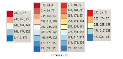
Colours for thematic mapping
Thematic maps, more formally known as choropleth maps, are great for conveying information about differences between areas. Using shaded and/or patterned polygons makes it easier to visualise geographic distribution of specific attributes. But picking colours to show those differences can be a problem – the bigger the more classes the data is divided into. Colours are especially important when you work with orderable, numerical data and want to pinpoint hostpots (either concentration or deficiency) of certain characteristics. Coming up with 4-colour scheme is easy, 6 is a stretch but 10 is a real challenge!
For clarity of information, it is best to avoid more than 5 classes because with more classes the difference in shades becomes too subtle for a human eye to easily distinguish a “hierarchy”. It is especially the case when using thematic overlay in combination with a multi-colour background (eg. as a transparent overlay on Google Map). Dividing the data into meaningful classes is a science on its own and I will come back to it in a separate post. Today I just wanted to focus on colour selection and to introduce a free online tool that will help in choosing the right combination.
 The most commonly used colours for thematic mapping are red, blue, green, and purple, with white, yellow or grey as a secondary, “lighter” colours in the mix. “ColorBrewer 2.0” is a great colour selection tool that allows to experiment with the most popular colour swatches in various combinations. It caters for 3 different data types: qualitative, sequential and diverging, and depending on the option, allows to specify up to 12 colour classes (as RGB, CMYK or HEX values). An interactive “map panel” allows previewing your selection with different transparency settings and background colours. ScoreCard feature provides a guide to useability aspect of the selected combination - in terms of potential issues for colour blind, B&W photocopying, colour-printing and/or displaying on LCD monitors.
To present “nominal/ qualitative data” which is un-orderable, non-numerical, the colour variation should not present a pattern and should be totally random. ColorBrewer allows do define up to 12 classes.
 To present “sequential data”, like for example counts by certain characteristics, it is best to use shades of a single colour. ColorBrewer allows do define up to 9 classes. If you are desperate for 10 class scheme, use YlorRD variant with white as 10th class.
For “diverging data”, that is data that oscillates around a certain “standardised value” (like mean or median), it is best to use 2 diverging colours with a neutral midrange shade. Again, ColorBrewer goes only to 9 classes but if you require 10 classes, it is easy to combine 6 class contrasting colours from sequential option (just ignore the first lightest class and merge remaining 5 shades from each colour scheme for your customised 10 colour swatch).
A final word of caution if you are working with KLM file format. It is a common convention to use colour sequence as Red–Green-Blue, then Alpha channel for transparency. However, KML standard specifies everything in reverse: Alpha-B-G-R! For example, if hex colour code for blue is 0x045A8D, in KLM it has to be written as ff8D5A04 (where the first two digits indicate alpha transparency of 100%, ie non transparent). And to save you a headache or two while trying to work out the right codes for different transparency settings in KML, here is a list of the most common values:
http://www.sgrillo.net/kml_color/
http://www.zonums.com/gmaps/kml_color
Related Free GIS Tools posts:
Google Map API
Address Validation Tool
Simple Geocoder
For clarity of information, it is best to avoid more than 5 classes because with more classes the difference in shades becomes too subtle for a human eye to easily distinguish a “hierarchy”. It is especially the case when using thematic overlay in combination with a multi-colour background (eg. as a transparent overlay on Google Map). Dividing the data into meaningful classes is a science on its own and I will come back to it in a separate post. Today I just wanted to focus on colour selection and to introduce a free online tool that will help in choosing the right combination.
 The most commonly used colours for thematic mapping are red, blue, green, and purple, with white, yellow or grey as a secondary, “lighter” colours in the mix. “ColorBrewer 2.0” is a great colour selection tool that allows to experiment with the most popular colour swatches in various combinations. It caters for 3 different data types: qualitative, sequential and diverging, and depending on the option, allows to specify up to 12 colour classes (as RGB, CMYK or HEX values). An interactive “map panel” allows previewing your selection with different transparency settings and background colours. ScoreCard feature provides a guide to useability aspect of the selected combination - in terms of potential issues for colour blind, B&W photocopying, colour-printing and/or displaying on LCD monitors.
To present “nominal/ qualitative data” which is un-orderable, non-numerical, the colour variation should not present a pattern and should be totally random. ColorBrewer allows do define up to 12 classes.
 To present “sequential data”, like for example counts by certain characteristics, it is best to use shades of a single colour. ColorBrewer allows do define up to 9 classes. If you are desperate for 10 class scheme, use YlorRD variant with white as 10th class.
For “diverging data”, that is data that oscillates around a certain “standardised value” (like mean or median), it is best to use 2 diverging colours with a neutral midrange shade. Again, ColorBrewer goes only to 9 classes but if you require 10 classes, it is easy to combine 6 class contrasting colours from sequential option (just ignore the first lightest class and merge remaining 5 shades from each colour scheme for your customised 10 colour swatch).

A final word of caution if you are working with KLM file format. It is a common convention to use colour sequence as Red–Green-Blue, then Alpha channel for transparency. However, KML standard specifies everything in reverse: Alpha-B-G-R! For example, if hex colour code for blue is 0x045A8D, in KLM it has to be written as ff8D5A04 (where the first two digits indicate alpha transparency of 100%, ie non transparent). And to save you a headache or two while trying to work out the right codes for different transparency settings in KML, here is a list of the most common values:
- 100% = ff
- 90% = e5
- 85% = d9
- 80% = cc
- 75% = bf
- 70% = b2
- 65% = a6
- 50% = 7f
- 30% = 4c
http://www.sgrillo.net/kml_color/
http://www.zonums.com/gmaps/kml_color
Related Free GIS Tools posts:
Google Map API
Address Validation Tool
Simple Geocoder
Monday, July 5, 2010
Arts on the Map
Lovers of Australian art can now search interactively for… Arts on the Map. This map centric website was published by the Australian Council for the Arts and features nearly 200 companies currently funded by the Council. Visitors can use a very simple yet quite attractive interactive search widget to query a database of various artforms or art companies in each State and Territory. The results are displayed as a side list and interactive markers on the map. There is also an alternative search option for stories published by individual art companies. The mapping application comes in two flavours, as Google Map or Google Earth version.
It is good to see that Google Maps and similar free online mapping applications have a wide range of potential uses. The truth is that if it wasn’t for Google, there would be no such interactive applications on the Internet. Before Google launched its maps such functionality was reserved only for expensive and/or technically challenging software that many could not afford, or would never contemplate, to deploy on their websites.
It is good to see that Google Maps and similar free online mapping applications have a wide range of potential uses. The truth is that if it wasn’t for Google, there would be no such interactive applications on the Internet. Before Google launched its maps such functionality was reserved only for expensive and/or technically challenging software that many could not afford, or would never contemplate, to deploy on their websites.
Thursday, July 1, 2010
Google Map API 5th Birthday
Five years ago, on 29 June 2005, Google officially released API for its online map to allow enthusiastic developers to add online mapping functionality and interactivity to thousands of websites. Current official figure of Google Map mashups stands at 350,000! What initially started as blatant but ingenuous hacks to present point data on an interactive map embedded in an ordinary HTML page was turned by Google engineers into a robust and continuously evolving tool that even the least experienced webmasters can easily deploy on their websites to mashup content from variety of sources.
 To commemorate the occasion Keir Clarke from Google Maps Mania released Mappybirthday Google Map mashup … to map Google Map mashups from around the World! There are some 300 individual applications mapped so far and you can add you own in one simple step. So, add your favourite Google Map mashups to the map and/or explore to see what is being mashed up in your country!
To commemorate the occasion Keir Clarke from Google Maps Mania released Mappybirthday Google Map mashup … to map Google Map mashups from around the World! There are some 300 individual applications mapped so far and you can add you own in one simple step. So, add your favourite Google Map mashups to the map and/or explore to see what is being mashed up in your country!
Thursday, June 24, 2010
Apps4NSW Winners announced
I have just got the official email - the joint winners in Apps category and, $15,000 in prizes each, go to (drum roll)... :
Demographic Drapes submitted by NuMaps

Suburban Trends by the Smart Mashups team (the second mashup win for this application!)

I have written about both applications before while reporting on Mashup Australia competition. It is not a surprise that applications focused on thematic mapping using statistics and demographic information came on top. There is a huge demand for such information not only from governments but also from business and private citizens. And even less surprising is that both applications are build on the backbone of Google Maps. Traditionally, such tools could only be created with high end GIS servers and although there is quite a capable server behind all NuMaps drapes/ layers Suburban Trends demonstrates that similar functionality can be achieved with much simpler, non-spatial tools.
The second prize and $10 000 was awarded to Bike Community Hub by the Bikey team and third prize and $5 000 to The School Hall by Jack Zhao:


Prizes were also awarded for ideas in open and school categories. The news is so fresh that the official Apps4NSW site has not been yet updated but I guess more information will appear there soon.
Congratulations to all the winners!
Demographic Drapes submitted by NuMaps
Suburban Trends by the Smart Mashups team (the second mashup win for this application!)
I have written about both applications before while reporting on Mashup Australia competition. It is not a surprise that applications focused on thematic mapping using statistics and demographic information came on top. There is a huge demand for such information not only from governments but also from business and private citizens. And even less surprising is that both applications are build on the backbone of Google Maps. Traditionally, such tools could only be created with high end GIS servers and although there is quite a capable server behind all NuMaps drapes/ layers Suburban Trends demonstrates that similar functionality can be achieved with much simpler, non-spatial tools.
The second prize and $10 000 was awarded to Bike Community Hub by the Bikey team and third prize and $5 000 to The School Hall by Jack Zhao:
Prizes were also awarded for ideas in open and school categories. The news is so fresh that the official Apps4NSW site has not been yet updated but I guess more information will appear there soon.
Congratulations to all the winners!
Tuesday, June 22, 2010
Google launches Fusion Tables
A few weeks ago Google announced the release of its new data service – Fusion Tables. Last week I finally got a chance to play with this latest tool from Google. It is a very impressive tool, with even mightier potential! Ok, it’s early days and currently available functionality is very simple but I am very excited about what it means for the future.
For a start, and there is no doubt about it, Fusion Tables is a database - and spatially enabled one! It can already be used as a replacement for myriad of low complexity MySQL tables that power so many websites. Fusion Tables supports simple SQL queries quite well. And since it can store KML objects, it is also a potential substitute for basic PostGIS, ArcSDE , Oracle Spatial or SQL Server with spatial extensions. It can’t yet handle more complex shapes (like multi part or doughnut type polygons) but when Google enables that functionality Fusion Tables will inevitably become the tool of choice for spatial applications developers working with Google Maps and Google Earth. Why would you bother to maintain your own servers (even if software is free) when Google can do it all for you for nothing, and in no time?!
When I first wrote about the Ingenuity of Google Map Architecture I concluded that there is a good change that Google Map and related applications will evolve into a very powerful set of tools, more than enough for many common GIS tasks. And it is certainly happening! I put forward a suggestion that in order to become a fully fledged GIS, Google Map needs map server functionality and a dynamic vector data management module. Google went about implementing the first one in its own way but it is practically there now: any large KMZ file is rendered as an image on Google Map. And Fusion Tables is a starting point for server side vector data management capability (starting with simple queries, although efficient serving of vector data is a longer term proposition). There is also available a little known Gogole cache database – which allows to enable efficient client side vector data management as well. When all three are ready to be put together to support Google Maps and Google Earth, it will be a mighty powerful GIS package!
Related posts:
Free GIS Tools - Google Map
Googe enables map customisation
Tuesday, June 15, 2010
The Extraordinary Taxi Ride
 How best to present a journey of 11 ordinary individuals from around the World in an ordinary Australian Taxi through not so ordinary Western Australia outback? Of course, on an interactive Google Map! The map is a part of The Extraordinary Taxi Ride website created by WA Tourism to attract local and overseas travellers to visit this wast and unique in many respects part of Australia. It has been created with Flash version of Google Map and depicts the route the travellers took on 11 individual trips. The map is annotated with commentary and photos marking significant points of interest along the route.
According to the announcement from WA Tourism Minister “…the campaign website had more than 160,000 visits, with people spending 15,000 hours following the ride”. “The campaign has many months to go, but already generated media exposure worth more than $2.6million and reached a potential global audience of more than 60 million… also had an immediate effect on tourism business with travel partners reporting double and triple-digit increases in bookings to WA.”
This is one more example of creative use of spatial technology in tourism marketing and PR campaigns. The key point is that simple online maps are finding their way into more and more diverse range of applications, not necessary as the main feature but nevertheless, as an important element of the overall package. There is enormous opportunity for creative application of traditional GIS functionality however, the simplicity of building interactive online maps also poses a challenge - it is not easy to convince project sponsors to use experts for the task rather than just web developers and graphic designers.
First spotted on: mumbrella.com.au
Related post:
There’s nothing like Australia
Maps in Viral Marketing
Saturday, June 12, 2010
Weather maps for winter resorts
 It’s winter again in Australia! Queen’s birthday long weekend marks the official start to skiing season. The easiest way to look up weather conditions for winter resorts is to visit aus-emaps.com snowfields weather maps for NSW and Victoria. The maps show locations of those resorts, the latest temperature from the Bureau of Meteorology weather stations as well as contain links to the latest forecast for the regions. Embedded webcams from several resorts allow checking actual snow conditions. The maps are a good starting point for exploration of more detailed information about each of the resorts.
Another website maintaining comprehensive winter weather information- including long range forecasts and snowfall models - is ski.com.au. And skibonk.com, offshoot of a very popular weatherbonk.com has also some relevant information covering Australian snowfields.
 This year Perisher Blue resort deployed Google Map also as an interactive virtual tour application. It is simple but quite clever concept of overlying a hardcopy trail map of the resort on Google Map and marking important features with categorised icons, matching “the perspective” of the printed map image. The map also has a number of embedded 360 degree images from selected points on the mountain tops that can be viewed in an interactive manner. It gives a good feel for what to expect when you visit the place. But no matter how clever the computer application is, it will never convey the real “chill and thrill” of being there in person!
Thursday, June 3, 2010
Tracking things with maps
 Maps and Geographic Information Systems are well suited for tracking things. Today just a couple of examples to illustrate usefulness of maps and spatially enabled technologies to monitor “assets” and follow “what’s happening”.
The first example is a tool from ZenTracker utilising Google Latitude service, which tracks location of service subscriber's smartphine in real time, and Google Map, to show that location in geographic context. ZenTracker then checks the smartphone location against user-defined rules and sends a notification if the location matches a specific rule. It is a great tool to monitor, for example, movements of kids. If they leaves a defined safe location a notification will be sent to alert a parent about the event. A year or so ago an announcement about a similar paid service, made a prime time news in Australia. ZenTracker basic plan is free and you can track up to 6 smartphones. For small companies, it is a very cost effective way to monitor location of trucks or delivery vans or sales force, provided you can equip them with appropriate smartphones.
 The second example falls into “event tracking” category and is just a basic visualisation approach to put "things into perspective". Gone Google map shows locations of businesses using Google Apps and it was created as a part of a campaign to persuade businesses to switch to Google Apps. For Google, it helps to track uptake of its applications in different geographic regions (and to make a point that many are using them!). For general public, it offers the opportunity to track who is adopting Google Apps in the local community (and to promote own business if they are users of those apps!). The information presented in a tabular format would not have the same impact.
First spotted on: Google Maps Mania
New spatial industry news portal
SpatialSource.com.au is the latest initiative of Intermedia Group – a publisher of many industry related magazines and a new owner of Position Magazine. Basic information is free and visitors can subscribe to a weekly electronic newsletter (also free) but most of the content is accessible only on subscription. I don’t know how true is a statement accompanying website launch that this is “…Australia's first news website for the geospatial industry” but it certainly adopted Mr Murdoch’s latest online news model - locking information behind paywalls.
Position Magazine had quite a good following amongst Australian spatial professionals. I do occasionally flick through it myself and always find a story or two worth reading. Summaries of the latest developments in the industry and new product information section are also good read. Transition from an enthusiasts driven, single title single industry publication to a publication that is a part of a stable of titles covering a wide variety of industries may be considered a sign that the spatial industry in Australia is finally getting noticed... Or at least is indicative of publisher’s confidence that the market is big enough to warrant some attention, for a profit.
Position Magazine had quite a good following amongst Australian spatial professionals. I do occasionally flick through it myself and always find a story or two worth reading. Summaries of the latest developments in the industry and new product information section are also good read. Transition from an enthusiasts driven, single title single industry publication to a publication that is a part of a stable of titles covering a wide variety of industries may be considered a sign that the spatial industry in Australia is finally getting noticed... Or at least is indicative of publisher’s confidence that the market is big enough to warrant some attention, for a profit.
Subscribe to:
Posts (Atom)


