Thematic maps, more formally known as choropleth maps, are great for conveying information about differences between areas. Using shaded and/or patterned polygons makes it easier to visualise geographic distribution of specific attributes. But picking colours to show those differences can be a problem – the bigger the more classes the data is divided into. Colours are especially important when you work with orderable, numerical data and want to pinpoint hostpots (either concentration or deficiency) of certain characteristics. Coming up with 4-colour scheme is easy, 6 is a stretch but 10 is a real challenge!
For clarity of information, it is best to avoid more than 5 classes because with more classes the difference in shades becomes too subtle for a human eye to easily distinguish a “hierarchy”. It is especially the case when using thematic overlay in combination with a multi-colour background (eg. as a transparent overlay on Google Map). Dividing the data into meaningful classes is a science on its own and I will come back to it in a separate post. Today I just wanted to focus on colour selection and to introduce a free online tool that will help in choosing the right combination.

The most commonly used colours for thematic mapping are red, blue, green, and purple, with white, yellow or grey as a secondary, “lighter” colours in the mix. “
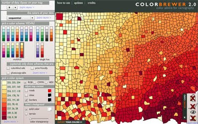
ColorBrewer 2.0” is a great colour selection tool that allows to experiment with the most popular colour swatches in various combinations. It caters for 3 different data types: qualitative, sequential and diverging, and depending on the option, allows to specify up to 12 colour classes (as RGB, CMYK or HEX values). An interactive “map panel” allows previewing your selection with different transparency settings and background colours. ScoreCard feature provides a guide to useability aspect of the selected combination - in terms of potential issues for colour blind, B&W photocopying, colour-printing and/or displaying on LCD monitors.
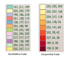
To present “nominal/ qualitative data” which is un-orderable, non-numerical, the colour variation should not present a pattern and should be totally random. ColorBrewer allows do define up to 12 classes.
 To present “sequential data”
, like for example counts by certain characteristics, it is best to use shades of a single colour. ColorBrewer allows do define up to 9 classes. If you are desperate for 10 class scheme, use YlorRD variant with white as 10th class.
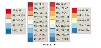
For “diverging data”, that is data that oscillates around a certain “standardised value” (like mean or median), it is best to use 2 diverging colours with a neutral midrange shade. Again, ColorBrewer goes only to 9 classes but if you require 10 classes, it is easy to combine 6 class contrasting colours from sequential option (just ignore the first lightest class and merge remaining 5 shades from each colour scheme for your customised 10 colour swatch).
 A final word of caution if you are working with KLM file format
. It is a common convention to use colour sequence as Red–Green-Blue, then Alpha channel for transparency. However, KML standard specifies everything in reverse: Alpha-B-G-R! For example, if hex colour code for blue is 0x045A8D, in KLM it has to be written as ff8D5A04 (where the first two digits indicate alpha transparency of 100%, ie non transparent). And to save you a headache or two while trying to work out the right codes for different transparency settings in KML, here is a list of the most common values:
- 100% = ff
- 90% = e5
- 85% = d9
- 80% = cc
- 75% = bf
- 70% = b2
- 65% = a6
- 50% = 7f
- 30% = 4c
And if you want to explore unlimited gamut of colours to define your totally custom swatches, try these tools as well:
http://www.sgrillo.net/kml_color/http://www.zonums.com/gmaps/kml_colorRelated Free GIS Tools posts:Google Map APIAddress Validation ToolSimple Geocoder
 News has just started circulating that Apple Inc. has purchased Poly9, Canadian mapping company. It developed a cross-browser, cross-platform 3D globe application, similar to Google Earth and Bing’s 3D globes, but which apparently "...did not require special plug-ins to work". The list of users included Skype and LinkedIn. The site is barely working now so I am unable to verify how good it was in comparison to Google and Bing but it appears it is build with Flash! So, it requires a plug-in after all. Also, it makes it quite an interesting development given Apple’s recent history of resentment towards Adobe Flash…