Friday, December 16, 2016

Australian generosity mapped – how charitable are we really?

Many Australians are happy to give a helping hand to various worthy causes throughout the year. Indeed, each year Australians hand over an impressive $2+ billion in tax deductible gifts and donations, and probably a bit extra in non-declared funds. But collectively, are we as generous as we claim to be? The facts may surprise you.

A new analysis of 2013-14 taxation data by MapDeck.com sheds some very interesting light on the donations habits of Australians. It provides a detailed picture of charitable donations made across neighbourhoods of our eight capital cities: Adelaide, Brisbane, Canberra, Darwin, Hobart, Melbourne, Perth and Sydney. MapDeck also provides a State/Territory specific view of donations for cross-border comparisons.

Looking at the findings first at a national level, it is encouraging that almost one in three Australian taxpayers is actively donating money for charitable purposes. However, a significant proportion of donations – amounting to 37% of the value of all donations – come from only 5.3% of taxpayers. These taxpayers live in 195 postcodes around Australia categorised as the ‘most generous’ in terms of the rate of donations per local population, as well as the average value of donations. In the 2013/14 tax year, these 677,093 individual donors collectively contributed a billion dollars for charitable purposes (or, on average, $1,416 per donor).


The remaining 3.8 million donors provided $1.6 billion of the total $2.6 billion donated that year (or, on average, $424 per donor). In addition, the fact remains that almost 8.3 million taxpayers (or 65% of all Australian taxpayers) reported no donations at all. So, it appears that Australians are not so charitable after all…

The level of generosity of donors differs significantly from one location to another. So, where do the most generous Australians live?


New South Wales was the state with the highest number of donors (1.45 million) but Victoria was not far behind, with just over 1.2 million. Interestingly however, the generosity of NSW donors far exceed that of Victorians – NSW residents donated $1 billion that year, a whopping 45% more than Victorians.

The average value of donations per donor was $707 in NSW and only $571 in Victoria. However, 38% of Victorian taxpayers made tax deductible donations, comparing to only 36% of NSW taxpayers. So, while NSW donors appear more generous, donating for charitable purposes is slightly more prevalent among Victorian taxpayers.

With exception of the ACT, the rate of donation and average values per donor for the other States and Territories are substantially below the two most populous Australian states.

Given the distribution of the Australian population, it is not surprising that almost 82% of all donations come from capital-city residents. The average donation per capital city resident was $655 in 2013/14, comparing to an average of $573 for all Australian donors.

On a city by city level, close to 40% of all gifts and donations reported to ATO in the 2013/14 financial year came from Sydney residents ($848 million), while residents of Melbourne contributed only 27%, or just over $607 million. Sydney, Melbourne and Brisbane accounted for a combined total of 80% of reported gifts and donations, while the remaining five capital cities made up only 20% of the overall sum.


Sydney-based donors contributed on average $872 in gifts and donations in 2013/14, and were followed by Melbourne and Canberra donors with average donations per donor of $638 and $603 respectively.


But which of our Australian capital cities has the most engaged community in terms of contributions to charitable causes? It turns out it is Canberra - the nation’s capital, filled with hardworking public servants and households with the highest average incomes. The city had the most generous population with 45% all tax paying individuals reporting gifts or donations on their statements. This compares to 39% for Melbourne taxpayers and just 36% in the case of Sydney taxpayers.

Hobart stands out amongst the smaller cities with 38% of taxpayers making tax deductible gifts and donations. Brisbane with Gold Coast and Perth closed the list at 33% each.

Putting the data published by the ATO through a slightly more advanced analysis can reveal even deeper insights about the generosity of Australians. For example, by comparing gifts and donations claimed by individual postcodes with averages for capital cities or Australia as a whole, it is possible to create a simple classification that reflects common patterns of behaviour across local communities.

Looking more specifically at the four categories of donors, of the most generous donors (that is, those that donate above average amounts and in above average proportions comparing to the national average) 42% live in NSW. Out of the 677,000 most generous Australian taxpayers, this amounts to a total of 287,000 individuals. Only 30% of the most generous donors, or 204,000 individuals, are located in Victoria.


However, 40% of the second most generous group of donors (that is, those who contribute at higher than average rates but tend to donate below average amounts) are from Victoria. NSW has only 34% of all donors in this category.

Without trying to fuel the animosity between the two states any further, this seems to be a typical pattern that distinguishes NSW residents from Victorians across several measures analysed in this study. That is, when NSW residents, and Sydneysiders in particular, decide to give, they give generously. Much more generously than residents of any other capital city or State or Territory in Australia. However, donating to charitable causes is more widespread amongst the population of Victoria.

Nevertheless, it is interesting to note that the postcode with the highest donation per donor was actually in Greater Melbourne area: it is 3944 (Portsea) with an average donation per donor of a whopping $19,187. Sydney postcode 2027 (covering the exclusive suburbs of Darling Point and Point Piper) with an average donation of $14,180 per donor is only third on the list - after Brisbane postcode of 4009 (Eagle Farm) with average donation of $18,490.


The following maps show how average donations compared across Greater Melbourne and Greater Sydney postcodes.


Map 1: Average Donations by Postcode – Greater Sydney, FY13/14


Map 2: Average Donations by Postcode – Greater Melbourne, FY13/14

The richness of information contained in this ATO data also makes it possible to investigate some more controversial aspects of our generosity. For example, pinpointing postcodes where residents earn the most but donate very little. There could be many colourful ways of describing the residents of such postcodes but, for the purposes of this article, let’s use a less judgemental label for them, such as “Well-to-do non-participants”. Which State or Territory do you think has the most residents in this category?

Log into your MapDeck.com account and find out!  A full deck of interactive maps is accessible to all registered MapDeck users via the links listed below. You will need this invitation code to create a free account if you are not yet a MapDeck user: f10dc1f2 .

And if you wish to explore the entire Generosity Profile of Taxpayers by Postcode, Australia 2014 data set and draw your own conclusions, or if you would just like to identify where those 195 postcodes with the most generous donors are located, it is available for a small fee for download in Microsoft Excel format and/or as a subscription for use with MapDeck’s Thematic Mapper app.

Implying that “Australians are charitable folks” would be an overstatement - the evidence summarised in this article points rather to the contrary. True, Australians are one nation but we tend to differ quite significantly as individuals, including how generous we are with gifts and charitable donations. However, not to affront our national pride, let’s draw the final conclusion borrowing from George Orwell’s famous quote. That is: it is quite likely all Australians are charitable by nature but some of us are more charitable in practice then others.


About Generosity Profile of Australian Taxpayers

The profiles area based on the Australian Taxation Office statistics for residential postcodes sourced from 2014 individual income tax returns processed by 31 October 2015. The statistics are not necessarily complete.

The information can be used for marketing and promotional purposes, or for profiling existing or prospective customers based on their place of residence.

Map (free):  Gifts and Donations by Individuals, Australia 2013-14
Map (free):  Gifts and Donations: Well-to-do Non-participants, Australia 2014
Data (free): ATO Gifts and Donations by Individuals, Australia 2014
Data (paid download): Generosity Profile Table, Postcodes, Australia 2014
Data (paid subscription): Generosity Profile of Taxpayers by Postcode, Australia 2014


About MapDeck:

MapDeck’s mission is to empower individuals and organisations to make better choices, more informed decisions – so they can reach their goals sooner, succeed faster and on a grander scale.

MapDeck is an online marketplace for spatial information and simple-to-use, task-oriented tools to support a variety of activities, be it business or investment related, environmental, community or policy focused.


Monday, November 28, 2016

Do the rich always get richer?

Let’s tackle this controversial topic as an example of how thematic maps and simple in-map analysis can bring clarity when dealing with complex issues or situations. 

'The rich get richer and the poor get poorer' is a common catchphrase that is often evoked in discussions about economic inequality. However, is this a true reflection of reality or just a widely held belief that is taken at face value? How do we tell?

It would probably take a few months to fully investigate all the factors that play a role in the complex issue of wealth concentration and to formulate a solid argument which could withstand full academic scrutiny.

However, as often happens in real life, we rarely have the necessary resources at our disposal, or the time, to do extensive research to get to the bottom of the issues we encounter. Therefore, a credible, quickly-determinable clue as to what that answer may be, and which allows us to make a more informed decision, is very often the most practical approach.

Map Deck's newly released Thematic Mapper app - with a unique in-map analytics functionality - offers everyone, even the most novice users, a simple solution that can aid in the search for answers to complex questions. Let’s explore how…

To begin our analysis we need information on the wealth of individuals, as well as statistics on how that wealth is changing over time.

Data on taxable incomes for postcodes for 2003–04 and 2013–14 income years, published by the Australian Taxation Office (ATO) and available for free perusal with MapDeck apps, is a good proxy. This information will give us an opportunity to test whether this widely held belief about rich getting always richer holds true in a spatial context. And in the process, we will also demonstrate how simple mapping tools can provide a reasonable answer - and quickly.

Distribution of taxable incomes (deciles) by postal areas - Adelaide [click to enlarge]

The objective here is to test if top taxable incomes grow consistently at or above the growth rate of taxable incomes of the entire population of Australian taxpayers.

If yes, then this would indicate that wealth of the richest individuals is increasing faster than wealth of the rest of the population and consequently, that poorer people are becoming relatively poorer over time. This is a simple argument but proving or disproving it will be enough to give us a strong clue as to the likely conclusions that would be obtained from more thorough research.

Change in taxable incomes over a decade to 2013-14 - Adelaide [click to enlarge]

It is always a good idea to clearly articulate assumptions and to identify limitations of the data you work with as it is not always possible to have the best and the most accurate information on hand for analysis.

In this case, for example, we defined “the rich” as taxpayers residing in postcodes with median taxable incomes in the top 10% in 2003-4 and in 2013-14.

The limitation of this approach is that we are looking only at the incomes and not the overall wealth of individuals. However, taxable incomes are a reasonable proxy for wealth. That is, wealth usually generates an income stream and even if only a part of that income is attributable to an individual, for example, due to the use of various tax minimisation schemes, growing wealth will be reflected in the growth of taxable incomes of those individuals.

We also assume here that residents of any given postcode are all alike which is an oversimplification but not an unreasonable one. In particular, it is true that postcodes comprise of populations with varying demographic and socio-economic status but summarising their collective characteristics into a single measure is an acceptable practice in data analysis. Therefore, a change in median taxable income for a postcode is a good representation of the change in wealth of its residents.

More of an issue is the fact that we are assuming that the 2016 postcode boundaries are exactly the same as those in 2013-14 and in 2003-04. However, yet again, this is a reasonable assumption since postcodes with the top taxable incomes are predominantly in capital cities and capital city postcodes remain relatively stable over time.

More assumptions and caveats could be listed but the main point here is the importance of being aware of the limitation of the data you are working with. It applies to any data and information, not only to that with spatial context.

It takes just a few moments to set up a map ready for analysis using MapDeck’s Thematic Mapper app. Firstly, we select and import into Thematic Mapper the postcode boundaries and ATO data, then join them using the data mixer functionality.

Thematic Mapper: data mixer

We are interested in only 3 columns from the newly created table: the median taxable incomes for both 2003-4 and 2013-14, and the percent growth of median taxable incomes over the 10 year period. The information on the number of individual taxpayers per postcode is included just for context.

Selecting the “complex legend” option enables advanced data filtering functionality in Thematic Mapper. We set taxable income values to show the top 10% range only (these values are calculated and can be looked up when setting up legend styles for individual data sets from our table).

The last step is to remove empty postcodes from the map (that is, those with no data) and to import a map overlay showing main roads and localities to give our map additional spatial context (the Stamen’s Hybrid layer in this case).

Let’s now review the map, summarise the data and draw some conclusions.

From the map legend we know that:

  • Top deciles of median taxable income were $33,503 to $68,017 in 2003-4 and $51,128 to $113,687 in 2013-14;
  • Median taxable incomes for individual postcodes grew between 7% and 257% over a decade to 2013-14;
  • Median growth in median taxable incomes was 50% (that is, in half of postcodes, median taxable incomes grew by less than 50% in the 10 year period and in the other half the growth was equal to, or greater than, 50% -  therefore the 50% growth rate can be used as a national benchmark for further comparisons). 
Growth in median taxable incomes 2003-04 to 2013-14, top income decile - Perth [click to enlarge]
Growth in median taxable incomes 2003-04 to 2013-14, top income decile - Brisbane [click to enlarge]
The pattern we were looking for (that is, where all top postcodes are coloured in shades of green, indicating growth rates over 50%) is present on both the Perth and Brisbane maps but not on the Melbourne or Sydney maps. Therefore, we can conclude with confidence that it is not entirely true that the rich are getting richer and the poor are getting poorer all the time and in every place.

Growth in median taxable incomes 2003-04 to 2013-14, top income decile - Sydney [click to enlarge]
Growth in median taxable incomes 2003-04 to 2013-14, top income decile - Melbourne [click to enlarge]

In other words, our data and simple in-map analysis indicate that some rich neighbourhoods grew their incomes at less than the national median rate, hence getting relatively ''poorer'' over time with respect to the rest of the population.

Of course, this is only a clue as to what conclusions may possibly be drawn from more thorough research. However, the point is that is takes very little effort to conduct this kind of analysis using MapDeck’s online app and huge range of available data. This approach is not suited for all situations but it can provide valuable insight, and fast, to adequately support many important every day decisions.

Median Taxable Incomes, Australia 2003-4 and 2013-14 map and ATO data table used in this case study are available for free perusal for registered MapDeck users.

And for a limited time, all MapDeck users have the opportunity to try Thematic Mapper at no cost. The app is available for a free one month subscription until 20 December. 

So, what is the big issue you would like to explore next? Use this invite code to sign up if you are not yet MapDeck user: f10dc1f2

About MapDeck:
MapDeck is an online marketplace for spatial information and simple-to-use, task-oriented tools to support a variety of activities, be it business or investment related, environment, community or policy focused.

We make spatial information and analysis ready data accessible to all. Locate, map, act!

Monday, November 21, 2016

Thematic Mapper for easy in-map analytics

The updated Thematic Mapper app, recently released on MapDeck.com's platform, unlocks in-map analytic capabilities for organisations of any size or budget.

Traditionally, access to spatial information, and the tools required for analysing and visualising that information, was restricted to only companies with substantial budgets. The two choices for an organisation were to either deploy a suitable infrastructure in-house and employ expert analysts, or alternatively, source specialist advice from external consultants.

Both these options have one thing in common - cost. We are talking about tens of thousands, and very often hundreds of thousands of dollars in annual expenditure. It's no surprise that many organisations could not afford location intelligence at these prices.

The arrival of cloud-based online mapping tools is changing all that, democratising access to vital information for everybody, even the smallest companies, as well as individuals.

Early adopters of cloud-based mapping solutions are realising enormous benefits - both monetary and strategic.

In particular, instant and on-demand access to inexpensive analytical tools and information (on any device) allows individuals at all levels in an organisation to take advantage of location intelligence while making important business decisions. This leads to better outcomes. 

And since better outcomes accumulate over time, it allows an organisation to reach its goals faster, more effectively, and with minimal expense. The benefits of using cloud-based mapping and spatial analysis tools are too good to remain the best kept secret for much longer.

With the release of the upgraded Thematic Mapper app MapDeck is taking the concept of in-map DIY spatial analytics to a whole new level.

Customised thematic map example

Thematic Mapper is an example of the new generation of online mapping tools which allow full personalisation of information content on maps. That is, unlike traditional online maps which require an administrator to configure for end users what data to display and how, Thematic Mapper gives each user full control over the entire map creation and map publishing/sharing process. It is a whole new approach to creating online maps.

Thematic Mapper users can now:
  • filter national and regional data to show just a selection of areas of interest, such as a single sales or franchise territory, retail catchment area, or a local neighbourhood;
  • combine public and private data, such as demographic statistics from Census surveys with company sales and customer data;
  • carry out in-map analysis on data and visualise results on maps and in summary tables;
  • customise presentation of information, from arrangement of preferred base maps and top overlays, to polygon styling according to personal preferences; and
  • publish or share privately all created content and information.

For a limited time, all MapDeck users have the opportunity to try Thematic Mapper at no cost. The app is available on a one month free subscription until 20 December 2016.

Use this invite code to sign up: f10dc1f2

About MapDeck:
MapDeck is an online marketplace for spatial information and simple-to-use, task-oriented tools to support a variety of activities, be it business or investment related, environmental, community or policy focused.

By collecting the most useful spatial data in one place, and providing simple tools to interact with it, MapDeck makes it easy for anybody to take advantage of location intelligence technology and to derive invaluable, personalised information for decision making.

Friday, October 7, 2016

Filtering mapped data by location

When visualising location related statistics on thematic maps – be it the median age of residents, their incomes or expenditure, house price values, or any other statistical information - one of the biggest challenges is how to limit what is displayed on that map to only a specific region of interest, such as a sales territory or similar user-defined geographic area. The updated Thematic Mapper functionality will make such a task a breeze.

This blog post is just another teaser for the upcoming release of the Thematic Mapper app and its purpose is to show off some of the advanced and truly unique in-map analytics functionality that will soon be delivered into the hands of MapDeck users.
 
Take this very common scenario which demonstrates Thematic Mapper’s distinctive capability: a user/researcher has statistical data covering a whole country but what is needed is only a summary report that profiles a specific geographic region. This area could be an individual sales or franchise territory, an economic region, local government area, or even a single postcode or suburb.

Filtering data on online maps in real-time by location of interest is not an easy task because of the limitations of current online map publishing technologies which require data and map styles to be pre-configured in advance by a publisher. This process cannot be left to individual users.

So, the traditional approach is to cut data into specified geographic areas as the first step in the publishing process and then to use only each subset of data for analysis and for display on the maps.

This is a very time consuming and inefficient process, especially if you have to analyse and publish a few dozens or more area profiles. Not to mention that the process has to be repeated for each user that requires a different set of custom areas (such as sales or franchise territories that each business defines differently). This is the reason why to date  the access to customised spatial information has been so difficult and expensive. 

What the user really needs is the ability to easily “hide” the boundaries outside of the area of interest (that is, mask those with irrelevant data) and to limit the statistical calculations to only a selected subset of data.

Thematic Mapper does this all effortlessly and on-the-fly. Like in the following example, where postal areas have been clipped to a custom geographic region, defined as “Greater Sydney”, and then joined with postal area data from the ABS’ Basic Community Profile 2011 and from the Household Expenditure Survey 2009.

In-map analytics with MapDeck's Thematic Mapper

The resulting map highlights where the largest sub-markets within the Greater Sydney region are and what the total estimated size of that entire regional market is, in dollar terms per annum.

This is yet another example of the power of Thematic Mapper, a truly personalised in-map analytics solution. Sign up to MapDeck.com for a free test run of Thematic Mapper when it is released.


Tuesday, October 4, 2016

Bringing the power of in-map analytics to all

The upcoming release of MapDeck’s Thematic Mapper app will make it very easy for anybody to visualise and analyse information on maps. 

We've included below just a teaser to highlight Thematic Mapper’s unique capabilities and to demonstrate the power of a new, totally personalised approach to online mapping.

Like, for example, on-the-fly polygon colouring – in this case, 70,440 residential mesh blocks in NSW by Statistical Area Level 2 region, to highlight actual distribution of housing within each boundary:

ABS Mesh Blocks 2016 coloured by SA2 areas


Or area profiling – in this case, colouring mesh blocks according to land use category and calculating total area of each category:

ABS Mesh Blocks 2016 coloured by land use category

Imagine the possibilities...


Friday, September 23, 2016

ABS releases Postal Areas 2016

Australian Bureau of Statistics has just released a new version of Postal Area boundaries as part of the 2016 update of the Australian Statistical Geography Standard (ASGS).

As the ABS explains, a postcode is a four digit number used by Australia Post to assist with mail delivery. Australia Post does not currently define geographic boundaries for postcodes. However, a number of organisations, including MapDeck, have created geographic boundaries that aim to define the geographic extent of the mail delivery area for each postcode.

Defining postcodes with a geographic boundary is an imprecise process, and this is demonstrated by the fact that there are variations in the boundaries released by different organisations. Additionally, postcodes cover most, but not all, of Australia; for example, western Tasmania is not covered by a postcode.

ABS Postal Areas 2016 coverage

Postal Areas (abbreviated as POAs) are an ABS approximation of Australia Post postcodes and are created to enable the release of ABS data on areas that, as closely as possible, approximate postcodes. This enables the comparison of ABS data with other data collected using postcodes as the geographic reference.

Postal Areas are approximated using one or more Mesh Blocks (MBs) from the 2016 edition of  the Australian Statistical Geography Standard (ASGS). This is a different approach than in 2011 where Postal Areas were built from much coarser Statistical Area Level 1 (SA1) boundaries and had a less accurate representation of actual postcodes.

In developing Postal Areas, each Mesh Block is allocated to a single Australia Post postcode. Postal Areas derived in this way only approximate postcode boundaries. Mesh Block allocations are based on the distribution of the estimated population within each Mesh Block, not on the total polygon area. These allocations have been determined using the best available information on postcode boundaries.

For the 2016 ASGS 2,670 Postal Areas have been defined. The codes used for the 2016 Postal Areas may not match those used in 2011 in some instances. Changes to codes occur where Australia Post abolished postcodes or changed codes between editions of the ASGS.

Map comparing POA 2011 (red) with POA 2016 (blue) boundaries

Some Australia Post postcodes are not included in the Postal Area classification. This occurs when no Mesh Block can be allocated to a particular postcode. There are two situations when this occurs where:
  • a Mesh Block covers more than one whole postcode, the Mesh Block can be allocated to only one postcode
  • more than one Mesh Block partially covers a postcode, but all the Mesh Blocks are allocated to other postcodes, based on the share of population with which they also share area.

Postal Areas exclude Australia Post postcodes that are not street delivery areas. These include post office boxes, mail-back competitions, large volume receivers and specialist delivery postcodes. These postcodes are only valid for postal addresses and are not a valid location for population data.

It should be noted that there are instances where postcodes cross state or territory boundaries.

Unlike MapDeck’s Postcodes 2016 dataset that references only officially gazetted localities, ABS’ Postal Areas are defined to cover the whole of geographic Australia without gaps.

Similarly to all versions of Australian postcode boundaries available on MapDeck, Postal Areas, Australia 2016 are free for use by all subscribers.


Related Posts:
Australian Postcodes Map 2016
Australian postcode boundaries 2016
Explaining holes in Postcodes 2016 coverage

Monday, September 19, 2016

In-map Analytics

Maps are not just pretty pictures - they are data and information visualisation tools that bring out hidden or not so obvious facts about locations of interest.

This one shows where 450,000 jobs are physically located in the City of Melbourne.

City of Melbourne - Employment Distribution 2015

Such information is just trivia for most people but it is an invaluable insight for a business trying to reach this market. Think in terms of finding the best location for a billboard advertisement, strategic parking of company trucks for maximum brand exposure to the largest possible audience, or identifying the best location for opening up a new cafe, etc. 

The ability to mix and filter non-spatial data in real time has been a basic feature of business intelligence software and data visualisation dashboards for many years now. However, the same functionality is very difficult to implement in mapping applications due to the complexities involved in real time merging of spatial data and the information that can be attributed to it.

Traditional online mapping software simply does not allow individual users to select their own data, and create and style maps dynamically to their liking in real time. So there is always a data publisher or administrator involved who decides what can be mapped and how. Needless to say, this uses up valuable time and adds additional costs to the process.

But the age of personalised online mapping, where users select the data then filter it and style however they want, is just around the corner! The upcoming upgrade to MapDeck’s Thematic Mapper app will put into your hands a very powerful, personalised, in-map analytical tool.

City of Melbourne - buildings constructed before 1950.


In the example above, the building footprints (spatial features) and the attribute information (such as the year of construction, building height, number of floors, total area, number of occupants, etc.) come from a different source. Yet, both can be merged easily using standard Thematic Mapper functionality and filtered to show only a required subset of information. And the resulting map can be styled to user liking. No data publishers or administrators are involved in this process.

More announcements are coming soon, stay tuned!


Tuesday, July 26, 2016

In Focus: 2016 Australian Statistical Boundaries

The Australian Statistical Geography Standard (ASGS) defines the boundaries, and respective relationships, of regions in Australia which the Australian Bureau of Statistics (ABS) and many other organisations use to collect, analyse and publish geographically classified statistics. 

To name a few examples, such statistics include Census-derived demographic and dwelling data, future population projections, labour force data and building approval rates.  

ASGS Volume 1 - Main Structure and Greater Capital City Statistical Areas, July 2016 has just been released by the ABS. It deals with the ASGS core structures, such as Mesh Blocks and Statistical Area Levels 1 to 4, and the Greater Capital City Statistical Areas (GCCSA).

The 2016 ASGS boundaries will be used for the publication of the 2016 Census of Population and Housing data and progressively introduced into other ABS data collections.

This is the second edition of the ASGS and it updates the 2011 edition for growth and change in Australia's population, economy and infrastructure. It also incorporates the Territory of Norfolk Island for the first time. Volumes 2 to 5 of statistical geography will be released progressively over 2016 through to 2018.

All boundaries from Volume 1 of 2016 ASGS have been published on MapDeck and complement the previously released 2011 data.

2016 Mesh Blocks on Statistical Area Level 2 boundaries

Correspondence files, describing the relationship between the 2011 and 2016 versions of the boundary data, will be added shortly to coincide with the upcoming upgrade of the Thematic Mapper app. These reference files can be used to recalculate 2011 Census statistics to present them on 2016 version of boundaries. Stay tuned for the updates.

Monday, July 18, 2016

In Focus: DigitalGlobe Recent Imagery Basemap

Curated, high-resolution images for nearly anywhere on Earth, captured by DigitalGlobe's constellation of satellites and published as a single map layer.

DigitalGlobe Recent Imagery Basemap is a compilation of the best satellite images from the DigitalGlobe Image Library. Individual scenes are colour-balanced so the mosaic gives the impression of a single, continuous depiction of the Earth's surface.

Mosaic of DigitalGlobe satellite images

The resolution of the images in this collection is between 30 cm to 60 cm per pixel. That is, the images capture significant surface area details.

The acquisition dates of the individual pictures vary throughout the world. For example, there are wide parcels of landmass captured in 2015 - mainly in the US and Europe, but the majority of the images date back to 2012-2014 or earlier (see DigitalGlobe’s web site for detailed information on vintage and resolution).

MapDeck users have instant and free access to DigitalGlobe Recent Imagery Basemap, as well as the Hybrid Layer, Street Overlays, Terrain map and Streets map.

Please note that personal versions of Digital Globe’s web services can also be set up on MapDeck using the Map Layers Manager app . Therefore, MapDeck users are not restricted to only publicly available satellite images but can utilise other image layers bought directly from Digital Globe.

DigitalGlobe Recent Imagery Basemap at close zoom

DigitalGlobe Recent Imagery is best for:
  • as an all-purpose image overlay;
  • as an image backdrop for transparent point-and-line layers, like streets or topographic overlays;
  • for a plethora of on-the-ground situation awareness applications (like, for example, property condition assessment, access or parcel boundaries inspections, determination of existence of structures, pools or solar panels on rooftops, vegetation distribution assessment, etc.) but the date of acquisition of the images in a particular location should be taken into account.

DigitalGlobe Recent Imagery Basemap is a perfect alternative to Google or Bing image and hybrid layers, and it can be personalised with a whole range of free data available on the MapDeck's platform.

Thursday, June 30, 2016

In Focus: OpenStreetMap Standard base map

Content, composition and timeliness of information make OpenStreetMap (OSM) the ultimate benchmark for all the online maps.

There is a whole range of base maps available for import into MapDeck apps. These maps can be used as the backdrop image for presentation of other spatially reference information. Selecting the right base map for this purpose may pose a challenge to the user due to the variety of options available so, in this series of “In Focus” posts, we are introducing the most popular alternatives to make your job easier.

OpenStreetMap Standard map is one of these alternatives. It contains information contributed by members of the public as well as official government data. The level of detail depicted on the map tends to be very high. The map covers the entire world and is continuously updated. 

OpenStreetMap Standard at medium zoom
Although data quality varies worldwide, it is fair to say that OSM surpasses content and timeliness of any other map. The cartographic presentation of the information is also very refined. This feature-rich base map is a default option on MapDeck.

OpenStreetMap Standard at close zoom


OSM Standard map is best for:
  • as a background for point or line data (e.g. routes) but it is generally too busy and too colourful for thematic content (e.g. choropleth maps);
  • showing small area details.

OSM is a precious public resource that underpins the operations of millions of organisations and businesses of all sizes, facilitating billions of dollars in economic activity throughout the world. We are writing about this map only in superlatives but the value of OpenStreetMap deserves to be fully acknowledged.

Friday, June 24, 2016

Help needed in cataloguing maps and web services!

MapDeck.com, in cooperation with aus-emaps.com, is embarking on the task of creating the largest public catalogue of ready-to-use, spatially referenced information. 

If you publish or know of any interesting web services with base maps, satellite/aerial imagery or thematic overlays you can be a part of this project by submitting a list of your favourite web services as a response to this post.

You can also help fund the initiative by signing up as a MapDeck user and creating catalogue entries yourself after purchasing the Map Layers Manager tool!


The objective is to create a human validated list of what is useful and working, and most importantly, that can be put to immediate use. That is, to catalogue spatial information that can be mixed and mashed to deliver personalised location intelligence for professionals as well as novice users.

The secondary objective is to validate and improve what is already known about the catalogued resources. Unfortunately, formal metadata for the majority of spatial information tend to be either non-existent or lacks any useful details. So, compiling complete and accurate details requires a group effort.


MapDeck platform can also be used to distribute pdf maps and data files, either directly or as part of value added online content. So, any links to potential sources of such information is also most welcome.

Please visit the mapdeck.com front page to preview what has already been catalogued. And if you would like to create your own records in the catalogue, or start using the information yourself, please email your request for an invite code to info@aus-emaps.com.

Wednesday, June 8, 2016

Australian Postcodes Map 2016

Postcodes are by far the most popular location reference for business purposes. However, the definition of postcode boundaries tend to be ambiguous due to the various methodologies applied during creation and because there are many versions of the data in circulation at any particular point in time.

In order to address some of that ambiguity, MapDeck has recently released the 2016 version of Australian postcode boundaries generated from open source information according to the rules defined by the Australia Post (which, theoretically, the organisation itself follows in defining the postcodes but in practice, it may not always be the case). The dataset is available for free perusal with MapDeck apps or can be downloaded in GIS format for a small fee.

Now there is also a free interactive map provided by MapDeck that presents the latest 2016 postcode boundaries on a base map with detailed road network and topographic features (sourced from the Open Street Map data).  For reference, we have also included Postal Areas 2011 boundaries (postcodes equivalent from the Australian Bureau of Statistics, created for use with 2011 Census data) and a Victoria-only version of postcodes published by the Victorian Department of Environment, Land, Water and Planning in April 2016.

Click to initiate the map (login required to view - contact aus-emaps.com to register)

However, MapDeck is all about personalising maps and spatial analysis, so users are not limited only to this map to view and interact with postcode boundaries. In fact, anyone can “roll their own” map, according to individual preferences, using the free Thematic Mapper Basic app. The app allows you to create interactive maps with a myriad of base map layers as well as other contextual information catalogued in MapDeck and available for immediate use.

Users who have the full version of Thematic Mapper can save personal copies of the map. That is, either edit the original map by adding or changing the base map layers and other data, or create a new one from scratch, then save the version as their own copy. These maps can be shared with other users as well. 

All in all, the map presented today is just an appetizer to demonstrate our latest postcode boundaries in the context of other spatially referenced information but also to inspire you to explore MapDeck functionality and personalise available content to your individual requirements.

Contact our Australian support team on info@aus-emaps.com for an invite code to join MapDeck. 

Monday, June 6, 2016

Data viewing in MapDeck

There are two ways to view data on MapDeck: either in a preview mode, using Data Viewer app, or via one of the purpose-built applications, such as Thematic Mapper or Sales Area Management Tool.
 

MapDeck’s functionality is broader than that of a traditional web-mapping application. That is, MapDeck is a consolidated publishing, cataloguing and information visualisation platform all in one. It enables specialised apps and associated data to be put to immediate use, the user requiring nothing more than just a web browser. 

Spatial data (vector geometry and image layers), tabular data (attributes), graphic and other files, as well as apps, are all listed in the MapDeck catalogue independently of each other. It is up to the individual user to find and select the right content that is suited for a particular purpose.

So, for example, if the primary interest of the user is in graphic/pdf maps or spatial data in the original GIS format, these files can be downloaded to a user computer and then opened with the user's favourite desktop software.

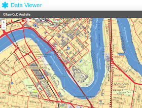
Any other table, map layer or vector data published on MapDeck can be previewed on its own in a generic Data Viewer app (provided you have access to that data set - that is, you are the owner or it is either a public dataset or you have subscribed to it). In other words, Data Viewer is a default app which displays content of a table, map layer or vector data set when a user clicks on a particular product.


Functionality of Data Viewer is very basic. In particular, vector geometry will be rendered in a preview window with a default style only and it will be presented on its own, with no option to display other contextual information. However, the data can be interacted with. That is, users are able to zoom in and out, pan the map and click on individual features to view attribute information, and vector features will respond to mouse-over events. Switching from “Map View” to “Table View” allows previewing attribute information for a given vector geometry and downloading it as a .csv file.


Image map layers are displayed in Data Viewer as an interactive map with pan and zoom functions enabled. Complex map layers, that is those comprising two or more sub-layers, will display just the top-most layer in Data Viewer and there is no option to switch between the sub-layers in a preview mode.


Attribute data tables can be previewed in Data Viewer’s Table View window.

Another option to view private and public tables, map layers, vector geometry, as well as compiled information directly in a browser, is to load them into a relevant MapDeck app.

MapDeck apps are purpose built tools that enable performing one or more (but very specific) tasks, like creating an interactive map (Thematic Mapper), defining and managing franchise or sales territories (Sales Area Management Tool), generating map images for printing in large format (Map Image Capture Tools) or configuring external web map services as MapDeck image map layers (Map Layers Management Tool). More options are coming.  

Once the user selects and starts a particular app, relevant data can be added and visualised using a common process which comprises of two steps: searching for content via the in-bulit Finder function and then selecting the item to add to the app.


Thereafter, each app deals with imported data in a unique way. For example, Thematic Mapper allows adding multiple image map layers as well as vector geometry layers, which then can be styled according to user preferences. Sales Area Management Tool only allows swapping one-base image map layer with another but it allows applying unlimited number of styles to imported vector polygon geometry to highlight different sales or franchise territories. And Map Image Capture Tool displays only information preconfigured and saved as Thematic Mapper or Sales Area Management Tool infosets.

At first, viewing data and information on MapDeck may appear as complex and ambiguous process – after all, you have to find what you are looking for in a large catalogue and then you have to create your own compilation of information rather than being given “a ready-made map”.  However, once you are familiar with the process, it is a very simple and straightforward task.

Just remember, to preview the data – all you need to do is click on a start icon to launch it in Data Viewer. For everything else is a Mapdeck app - launch it first, then add the data you are interested in. As simple as that!


Monday, May 9, 2016

Explaining holes in Postcodes 2016 coverage

When displaying Postcode Boundaries, Australia 2016 on a map you will notice that there is a lot of “empty space”. The expectation is that postcodes should cover the entire country, yet this is not the case for the reasons explained below.

Defining postcode boundaries should be a straightforward exercise since:
  • Australia Post officially declares that “postcode numbers are applied only to officially gazetted localities”, and since
  • gazetted localities cover, without overlaps, almost the entire continent, therefore
  • combining gazetted localities with a list of allocated postcodes should allow creating postcode boundaries that cover Australia without the gaps.
Simple, right? Not quite…


Australian Postcodes 2016 coverage

The reality is that:
  • There are places around Australia which do not have officially gazetted localities. For example, there are places with no permanent population (in the case of North West South Australia for example) or which have no formal recognition by local authorities for whatever reasons (in the case of Canberra surrounds). Hence, no postcodes can be allocated to those areas.
  • There are places which have gazetted localities but, for unknown reasons, those locations are not recognised by the Australia Post. So, they do not have postcodes assigned to them. This happens mainly in NT and Queensland but also for locations such as national parks or similar, mostly remote and uninhabited places.
  • There are places which are not officially gazetted localities so have no defined boundaries, yet they have assigned postcodes by the Australia Post. Point in case is the locality of Majura near Canberra with the allocated postcode number 2609. To make things more complicated, this locality also covers the officially gazetted locality of Pialligo (with the same allocated postcode number so, no big drama) but it also partially overlaps Canberra’s suburb of Watson which has a postcode number 2602.
  • Then there may be cases of locations that could be on the Australia Post postcode list but are not referenced with a postcode number in publicly available version of the list. So, such locations cannot be identified outright - unfortunately, Australia Post does not license freely its information.

As you can see, despite all the good intentions, the reality is quite messy. Therefore, the only way to deal with this complexity is to stick to a strict definition of what postcode boundaries should be. That is, to the Australia Post defined relationship between postcode numbers and locations where: “Postcodes are only allocated to localities officially gazetted by State land agencies”.

This way all major metropolitan areas are well covered with postcode boundaries and the issue of “gaps in coverage” is limited mainly to small, rural communities. The downside is a map that appears to have large chunks of Australia not covered in postcodes.


Using postcodes as a “widely recognisable and understood spatial reference to locations” is a deceivingly attractive proposition. In particular:
  • postcode numbers are part of an address, hence, theoretically, postcodes can be easily linked to specific locations;
  • everybody knows their postcode so it is very easy to solicit that information from clients or respondents to a survey, or from persons enquiring about a service, etc.
  • it is easy to use postcode groups to define sales territories or franchise areas,
  • postcodes are convenient for information aggregation purposes, without the need to resort to time consuming and potentially expensive geocoding of input data,
  • postcodes are large enough to provide good level of anonymity, so input data cannot be attributed to its sources (ie. inputs can be “confidentialised”),
  • at the same time, postcodes are small enough to highlight differences or similarities between local neighbourhoods. 

However, using postcodes boundaries is not without some serious issues due to:
  • ambiguity of how postcode numbers refer to locations,
  • existence of many versions of data at any particular point in time, and
  • their constant change.

You will find additional informaion on the limitations of postcode boundaries in our earlier articles on this topic:

Australian Postcodes User Guide
Comparing ABS Postal Areas 2011 and Postcode Boundaries 2016


All in all, gaps in Postcode Boundaries, Australia 2016 are the result of the methodology applied in creation of this dataset. MapDeck version of postcode boundaries may not suit all purposes and users should have a proper understanding of the limitations of this data set if they intend to make any use of it. 

Our recommendation is that, it is best to avoid postcodes (any version) and use instead more voluminous (in terms of count and data size) but more stable over time gazetted localities boundaries.

Friday, April 29, 2016

Comparing ABS Postal Areas 2011 and Postcodes 2016

Postal area boundaries, created by the ABS for the purpose of publishing 2011 Census statistics, are becoming dated. No updates have been announced as yet so, the question is, should you still be using this dataset?

You will need to consider two issues to answer this question:
  • what data are you going to reference to postcode boundaries, and;
  • whether there is a material difference between the 2011 representation of postcodes and their more up-to-date version in the area of your interest.

Despite the fact that ‘Postal Areas’ data is more than five years old, it is still the only option to use with Census 2011 statistics. It will be more than a year before any data from the upcoming Census 2016 is made available. So, the 2011 version of ‘Postal Areas’ will continue to be relevant for a while yet.

However, if you are working with other data, such as ATO statistics or recent survey data that reference respondent postcodes, then the more up to date representation of postcodes is the recommended option - choose ‘Postcode Boundaries, 2016’ edition then.

Both datasets are available for free perusal with MapDeck apps and the 2016 version can be downloaded in .shp format for a small fee.

Rural Victoria: Postal Areas 2011 in red and Postcodes 2016 in blue


The difference between these two versions of postcode boundaries datasets can be quite dramatic in rural areas (as the above example demonstrates) but it is generally less pronounced in long-established metropolitan areas.

Sydney Metro: Postal Areas 2011 in red and Postcodes 2016 in blue


You can compare how both boundaries  match in specific locations using a free version of the Thematic Mapper app (available to registered MapDeck users). Contact aus-emaps.com for an invite code to sign up for the MapDeck platform.

Thursday, April 21, 2016

Australian postcode boundaries 2016

A new, free dataset showing spatial extents of Australian postcodes has just been released for use with MapDeck apps.

Australian Postcode Boundaries are approximations of Australia Post postcodes and are current as of February 2016.  The product is based on a collection of open source data, such as recently released PSMA Suburbs - Localities February 2016 data and listings of postcodes by locality from Geonames.org.

Australian Postcode Boundaries 2016 edition


Gazetted Localities with Postcodes, Australia Feb 2016, a by-product generated in the production of postcode boundaries, is released as a separate product.

All input data has been cleaned and topologically corrected so postcode and locality boundaries are suitable for further spatial transformation and reprocessing.

Both datasets: Postcode Boundaries, Australia 2016 and Gazetted Localities with Postcodes, Australia Feb 2016, have undergone a significant transformation and are considered value added products. They can be downloaded from MapDeck in SHP format for a small fee.

Postcodes are very popular and convenient reference to locations. They are often used for publishing social statistics as well as for defining sales, service, franchise or dealership territories.

There is no single, authoritative representation of Australian postcode boundaries and several different versions are in use. For example, Australian Bureau of Statistics publishes in 5 year intervals a set of Postal Area boundaries, specifically for use with Census statistics. These boundaries are compiled using Statistical Area Level 1 geometry. They approximate official Australia Post postcode coverage at the time of publishing. MapDeck users can access this version of postcode boundaries under the name of Postal Areas, Australia 2011. It is free for use with MapDeck apps.

There are also a number of private companies that produce and regularly update their own versions of postcode boundaries. These can be imported into MapDeck for private use if required. Since the cost of obtaining these products can be substantial, we recommend comparing and weighing the benefits and limitations of each option against your specific requirements.