Immersive 360° videos of streets have been around for a while now but I am always very excited when I have a chance to view new and “exotic” locations. Now videostreetview.com site has integrated video content with Google Map to show routes and direction of the currently screened content. Available for viewing are numerous Swiss towns and several locations in the Middle East and South-East Asia.
Google had an option to adopt similar technology for its version of StreetView but settled for a much simpler solution based on static images. I have written about immersive video technology and Google in greater detail in my earlier post from 2009. Immersive 360° video streaming technology is making a progress but at a slow pace. The videos are always fun to watch and interact with – enjoy!
First spotted on Google Maps Mania
Related Post:
Immersive video yet to make its mark
Wednesday, February 23, 2011
Tuesday, February 22, 2011
Christchurch earthquake
No relief from natural disasters in this corner of the world. This time the tragedy has struck New Zealand town of Christchurch. A powerful and shallow earthquake of 6.3 in magnitude, with epicentre just about 10 km south from the town centre, has severely shaken the city knocking down many houses and office blocks. Current death toll stands at 65 but hundreds are reported missing. My heart goes out to all those affected, especially those who lost loved ones.
Spatial community in New Zealand has quickly mobilised and deployed Ushahidi platform to assist with dissemination of vital information from authorities as well as that reported by individuals in the affected areas: http://eq.org.nz/
More maps of the event:
- US Geological Survey site
- aus-emaps.com publishes earthquake information on a shareable map (this link includes shake modelling for Christchurch earthquake)
- Geosciene Australia map with seismograms
Sunday, February 6, 2011
Perth bushfires
From one extreme to another… today top news is bushfires in WA and on the outskirts of Perth. Tens of houses have already been lost. Alerts are published by Fire and Emergency Services WA and the Department of Environment and Conservation. I was looking for online maps but could not locate anything with exception of the good old FireWatch. So, here is a couple of screen captures from aus-emaps.com Bushfire Incidents map:
Interestingly, DEC publishes number of hits on its online reports and numbers are quite surprising… high tens but no more than 200. There is lots of text, occasional situation map in pdf but overall not an easy read… It appears that despite all the initiatives, by the community, the governments of all levels, academics, media and private companies there is still no single “geographic information system” available for the public to see first hand what is happening in near real time. There is still a big void in information. Why? Is lack of funding the main issue or lack of coordinated approach by various authorities? Or lack of enthusiasm to carry on development and support for something that may only be used a few days a year (…every few years!)? It would be interesting to hear from others what do you think …
End Note:
The latest community initiative called Bushfire Connect will be officially launched on Monday 7th February, initially focusing only on Victoria.
Wednesday, February 2, 2011
Another disaster looming for Oz
After devastating floods in January 2011 Queensland is now bracing for the impact of category 5 cyclone Yasi. It is expected to hit Australian coast somewhere between Innisfail and Cardwell at about 11pm EST this evening, with winds over 200km/h. Emergency Management Queensland issued warnings that Yasi can cause “extensive damage and result in death or injury caused by flooding, buildings collapsing or flying debris.” The wind has already picked up to 93 km/h at Hamilton Island airport (6 pm AEDT).
Australian Bureau of Meteorology warns about "EXTREMELY DANGEROUS SEA LEVEL RISE [i.e. storm tide]… EXTREMELY DAMAGING WAVES, STRONG CURRENTS and FLOODING" as the cyclone approaches. Between Port Douglas and Ayr the winds will become DESTRUCTIVE with gusts in excess of 125 km/hr. Cyclone Yasi is expected to reach inland as far as Mt Isa.
The latest satellite image of the approaching cyclone and wind speed information for the impact area can be monitored live on aus-emaps.com’s Hazards Monitor pages (courtesy of free Bureau of Meteorology web services):
[click wind icon in the top left corner of the map to add wind speed information layer and click/ move your mouse over the markers for details]
Updates:
[02/02/2011 at 8pm AEDT] Latest BOM update on tropical cyclone Yasi: just a crude "translation" of predicted path into kmz format for easy sharing on a map .
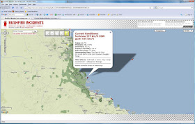
[03/02/2011] It is not totally over yet but media reports indicate there was no major disaster: no lives were lost and although there are many damaged houses and almost 190,000 people without electricity, overall impact of Cyclone Yasi will most likely not be as devastating as was initially anticipated. Below some pictures documenting the event, as captured by various aus-emaps.com tools.
Related posts:
Another natural disaster tragedy in Oz
Bushfires (with special feature on 2009 Victorian bushfires)
[02/02/2011 at 8pm AEDT] Latest BOM update on tropical cyclone Yasi: just a crude "translation" of predicted path into kmz format for easy sharing on a map .
[03/02/2011] It is not totally over yet but media reports indicate there was no major disaster: no lives were lost and although there are many damaged houses and almost 190,000 people without electricity, overall impact of Cyclone Yasi will most likely not be as devastating as was initially anticipated. Below some pictures documenting the event, as captured by various aus-emaps.com tools.
[Yasi location at 9pm AEDT on 02/02/20011]
[Weather station reading near Halifax/ Ingham at the time of impact showing wind speed of 137 km/h and gusts up to 165 km/h - very high but half of what was anticipated and may explain why the damage to infrastructure was not so extensive.]Related posts:
Another natural disaster tragedy in Oz
Bushfires (with special feature on 2009 Victorian bushfires)
Tuesday, February 1, 2011
How maps can improve sales
There is a saying “Half the money spent on advertising is wasted; the trouble is you don't know which half.” The statement attributed to John Wanamaker, who is considered to be the father of modern advertising, illustrates how difficult it is for a business to come up with an optimal advertising strategy that will deliver maximum results, at the minimum cost, and with minimum wastage.
If you try using “a bit of everything” you are spreading your resources too thinly. Focus too much on a single advertising channel and you are potentially missing out on some big opportunities elsewhere.
For example, online social media engagement for promotion of business is the latest communication channel rapidly gaining in popularity (and hype) but should it be the only channel? Will it deliver in your line of business and for your geographic market? It’s one of those dilemmas: "damn if you don’t engage, damn if you do…" so, one way of prioritising which advertising and promotional options to pursue is to compare alternatives based on total reach, proportion of target population reachable through the channel, duration and timing of exposure, and overall costs involved.
Although the optimal mix of advertising and promotional activities will depend on what you are selling, the target audience you are pursuing (ie. whether global or local) and the scale of you operations, however there is one simple activity that should always be seriously considered – contacting your potential clients directly (either cold calling, sending snail-mail or just arranging for letterbox drops). Why? Because of simplicity of implementation of this option. And not to mention that the campaign can be personalised, can be localised (either for testing or to stage a rollout if your budget or response handling capacity is limited), you can easily measure the results and it can be very inexpensive.
The rest of this article is a case study on how maps and simple spatial analysis techniques can improve efficiency of direct marketing activities and ultimately, sales results. Traditionally, such methods have been restricted to only large companies due to the cost of analytical tools and/or specific skill set required to undertake the analysis. However, with the advent of free mapping solutions and increasing volumes of free data liberated by State and Federal governments with Creative Commons licensing, the capability to undertake spatial analysis is well within reach of business enterprises of any size.
Case Study
Challenge: Your target market is property investors in Canberra and you have a budget for a letterbox drop of promotional materials about investment loan refinancing options to 10,000 prospects. Your objective is to maximise effectiveness of the campaign (ie. get the best return on your bucks!).
Solution: The key to the success of your campaign is to know which are the areas that offer the best opportunity to reach your target audience. The easiest way out would be just to pick the most affluent postcodes and do your mailbox drops there. But is this the optimal approach? And which are those “affluent postcodes’?
There is a good range of free information available from the Australian Bureau of Statistics that could help with the campaign but for this particular campaign there is even better free data source: statistics on personal returns from the Australian Taxation Office that show numbers of property investors in each postcode.
Equipped with that data you can do a simple analysis classifying and sorting the postcodes based on a couple of variables: overall proportions of people claiming rental investment expenses in each postcode and the value of their claims in relation to the ACT average. This will allow to pinpoint specific postcodes with the highest probability of reaching the target audience (ie. the highest proportion of taxpayers claiming the highest loses).
Focusing just on the postcodes with the largest number of property investors is not the most optimal approach since population counts in each postcode vary dramatically. So, the absolute number of investors in a given postcode may be high but proportionally to the overall number of people in that postcode, there may not be many prospects there. And besides, you would also want to find people with the largest mortgages to optimise your efforts. Therefore, that extra analytical step can be very beneficial. This way it is possible to derive a meaningful ranking measure of postcodes based on the concentration of people with sought after characteristics in each postcode.
Mapping the results will help to visualise the location of your target audience and to manage distribution of promotional materials. Thematic map shown below is an illustration of the outcome of a simple analysis outlined above and shows detailed boundaries of target postal areas (dark red polygons indicate areas with highest concentration of target audience).
Conclusion: The campaign should focus on postcodes 2600 and 2603 (with approximate number of 10,500 taxpayers and 2,675 total potential clients). Targeting these postcodes will give you the most optimal, 1 in 4 chance, to reach your audience.
This case study demonstrates that running campaigns in an ad hoc manner cannot deliver optimised outcomes. Even if you have limited resources, simple analysis and mapping of the results can help immensely in maximising the return on your efforts.
If you try using “a bit of everything” you are spreading your resources too thinly. Focus too much on a single advertising channel and you are potentially missing out on some big opportunities elsewhere.
For example, online social media engagement for promotion of business is the latest communication channel rapidly gaining in popularity (and hype) but should it be the only channel? Will it deliver in your line of business and for your geographic market? It’s one of those dilemmas: "damn if you don’t engage, damn if you do…" so, one way of prioritising which advertising and promotional options to pursue is to compare alternatives based on total reach, proportion of target population reachable through the channel, duration and timing of exposure, and overall costs involved.
Although the optimal mix of advertising and promotional activities will depend on what you are selling, the target audience you are pursuing (ie. whether global or local) and the scale of you operations, however there is one simple activity that should always be seriously considered – contacting your potential clients directly (either cold calling, sending snail-mail or just arranging for letterbox drops). Why? Because of simplicity of implementation of this option. And not to mention that the campaign can be personalised, can be localised (either for testing or to stage a rollout if your budget or response handling capacity is limited), you can easily measure the results and it can be very inexpensive.
The rest of this article is a case study on how maps and simple spatial analysis techniques can improve efficiency of direct marketing activities and ultimately, sales results. Traditionally, such methods have been restricted to only large companies due to the cost of analytical tools and/or specific skill set required to undertake the analysis. However, with the advent of free mapping solutions and increasing volumes of free data liberated by State and Federal governments with Creative Commons licensing, the capability to undertake spatial analysis is well within reach of business enterprises of any size.
Case Study
Challenge: Your target market is property investors in Canberra and you have a budget for a letterbox drop of promotional materials about investment loan refinancing options to 10,000 prospects. Your objective is to maximise effectiveness of the campaign (ie. get the best return on your bucks!).
Solution: The key to the success of your campaign is to know which are the areas that offer the best opportunity to reach your target audience. The easiest way out would be just to pick the most affluent postcodes and do your mailbox drops there. But is this the optimal approach? And which are those “affluent postcodes’?
There is a good range of free information available from the Australian Bureau of Statistics that could help with the campaign but for this particular campaign there is even better free data source: statistics on personal returns from the Australian Taxation Office that show numbers of property investors in each postcode.
Equipped with that data you can do a simple analysis classifying and sorting the postcodes based on a couple of variables: overall proportions of people claiming rental investment expenses in each postcode and the value of their claims in relation to the ACT average. This will allow to pinpoint specific postcodes with the highest probability of reaching the target audience (ie. the highest proportion of taxpayers claiming the highest loses).
Focusing just on the postcodes with the largest number of property investors is not the most optimal approach since population counts in each postcode vary dramatically. So, the absolute number of investors in a given postcode may be high but proportionally to the overall number of people in that postcode, there may not be many prospects there. And besides, you would also want to find people with the largest mortgages to optimise your efforts. Therefore, that extra analytical step can be very beneficial. This way it is possible to derive a meaningful ranking measure of postcodes based on the concentration of people with sought after characteristics in each postcode.
Mapping the results will help to visualise the location of your target audience and to manage distribution of promotional materials. Thematic map shown below is an illustration of the outcome of a simple analysis outlined above and shows detailed boundaries of target postal areas (dark red polygons indicate areas with highest concentration of target audience).
[full report can be downloaded for free from: aus-emaps.com/reports/ ]
Conclusion: The campaign should focus on postcodes 2600 and 2603 (with approximate number of 10,500 taxpayers and 2,675 total potential clients). Targeting these postcodes will give you the most optimal, 1 in 4 chance, to reach your audience.
This case study demonstrates that running campaigns in an ad hoc manner cannot deliver optimised outcomes. Even if you have limited resources, simple analysis and mapping of the results can help immensely in maximising the return on your efforts.